Heartcade
2020
Team: 7 people
Methods: User Research, Wireframing, Usability Testing, UI Design
Toolkit: Sketch, Photoshop, Illustrator
Heartcade
Summer 2020 (6 months)
Team: 7 people
Methods: User Research, Wireframing, Usability Testing, UI Design
Toolkit: Sketch, Photoshop, Illustrator
Say goodbye to swiping.
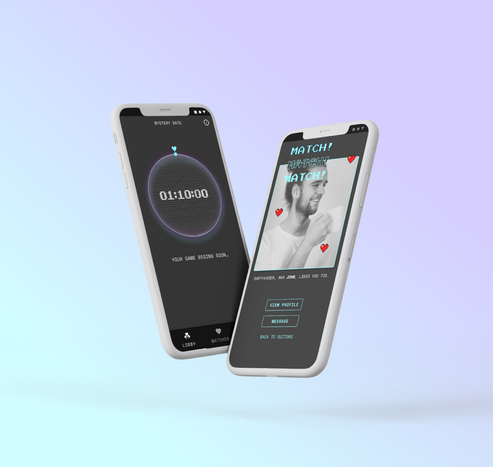
Heartcade is gamified dating. Users are matched by playing games, making a fun dating experience. My role was to research, design the structure and flows, and develop the initial UI. I collaborated with product development and engineering to launch this project.
Challenge:
My challenge was to create an exciting, gamified dating experience while prioritizing the MVP features. How do I address dating fatigue and distinguish this app from others on the market?
Solution:
Heartcade innovates on the matching process, where people play games to match. I was responsible for creating the architecture and flows, formative testing, and design work until Beta 2. Heartcade was launched in the app store in early 2021.
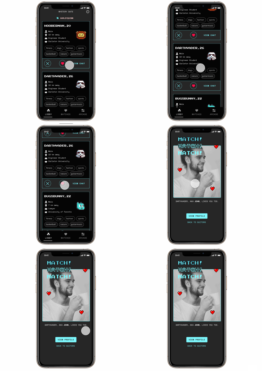
PLAY TO MATCH
Match by playing games. Win their heart - literally.
USER RESEARCH
Understanding Pain Points
I began with secondary research to collect information about online dating. Almost a quarter of all adults in North America are on dating apps, with a whopping 75% between 18-24. Through our personal network, the founder and I talked to 8 people between 20-25 years old who were daily users of dating apps.
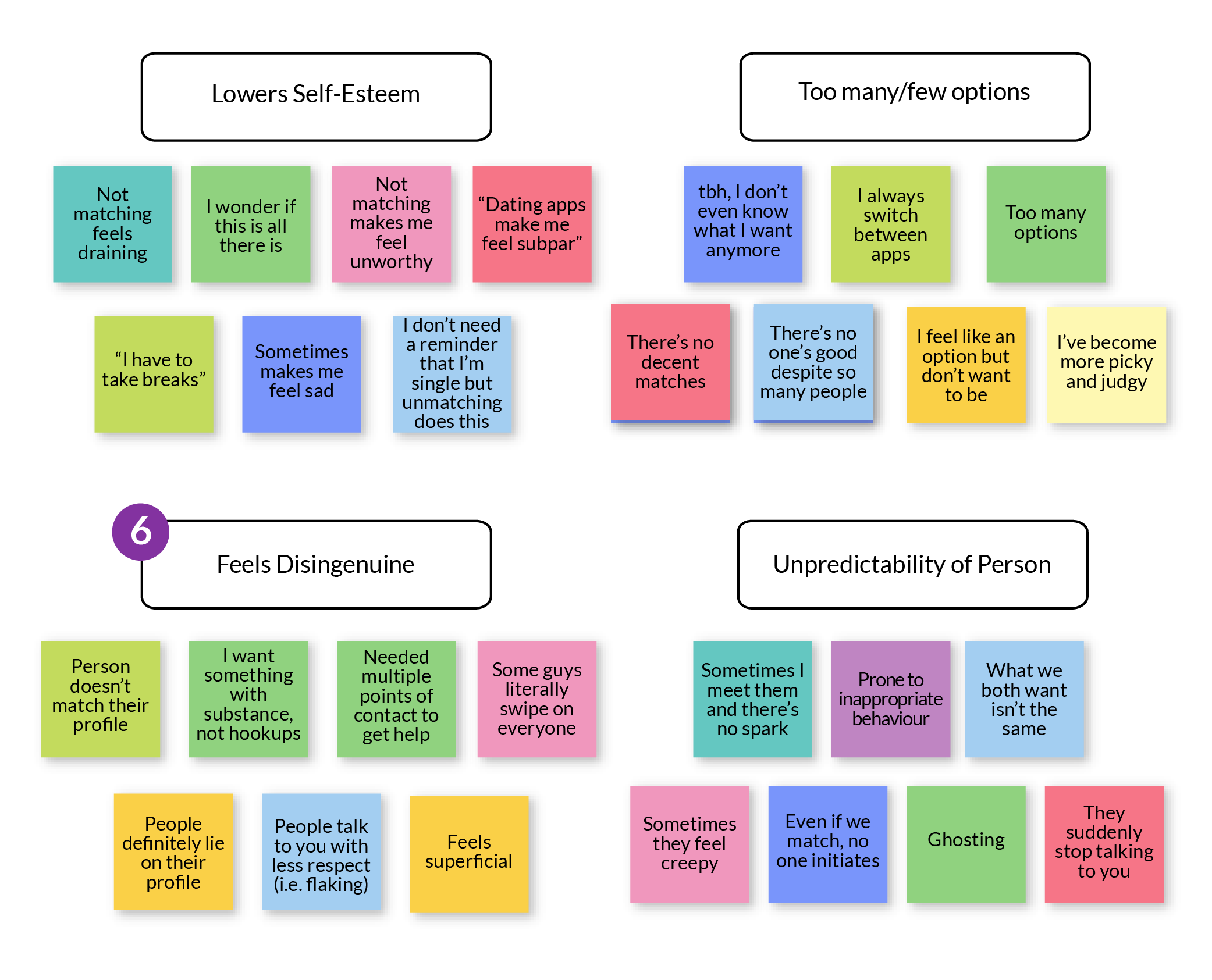
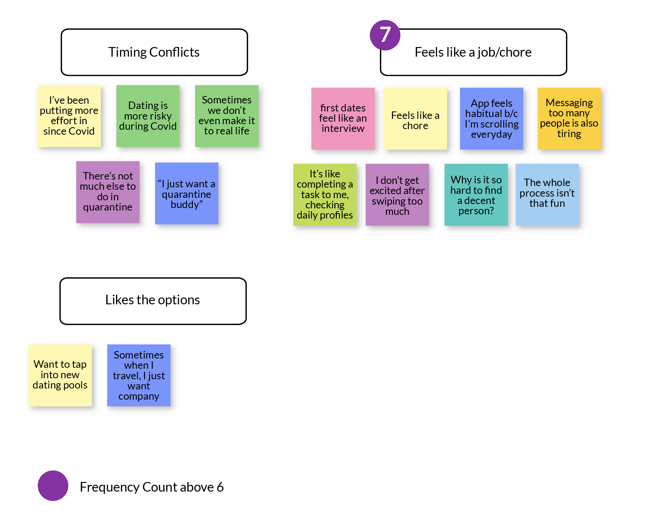
Some key interview findings were how dating fatigue occurs from daily multiple rejections (also from not matching with anyone), too many options, and inauthentic connection.
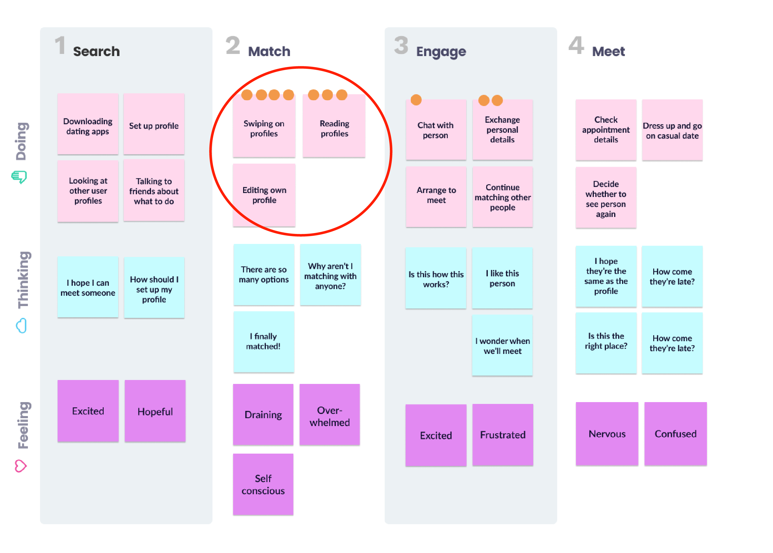
Affinity Diagram
Journey Map
After mapping these out, we identified the “match” phase as the step with the most opportunity.
Motivations & Needs
When searching profiles, I want unique matches, so that there’s something for me to look forward to.
When deciding to match, I want to have a way to interact with them, so that I can gauge character over the profile.
When looking at candidates, I want it to be a fun process, so that I can be entertained even without matching.
IDEATION
Being too ambitious at first...
Initially, we brainstormed as a team to have multiple games featured. Imagine being able to arrive at an arcade, and selecting the game you wanted to match! However, it quickly became evident that this project would be too large in scope. As a designer, I realized there would be so many flows and architecture considerations to be made. So we decided to focus on one game to begin, and to strategize the development.
With many ideas, we chose a blind-dating game.
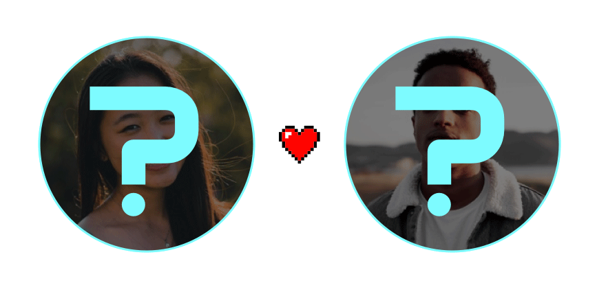
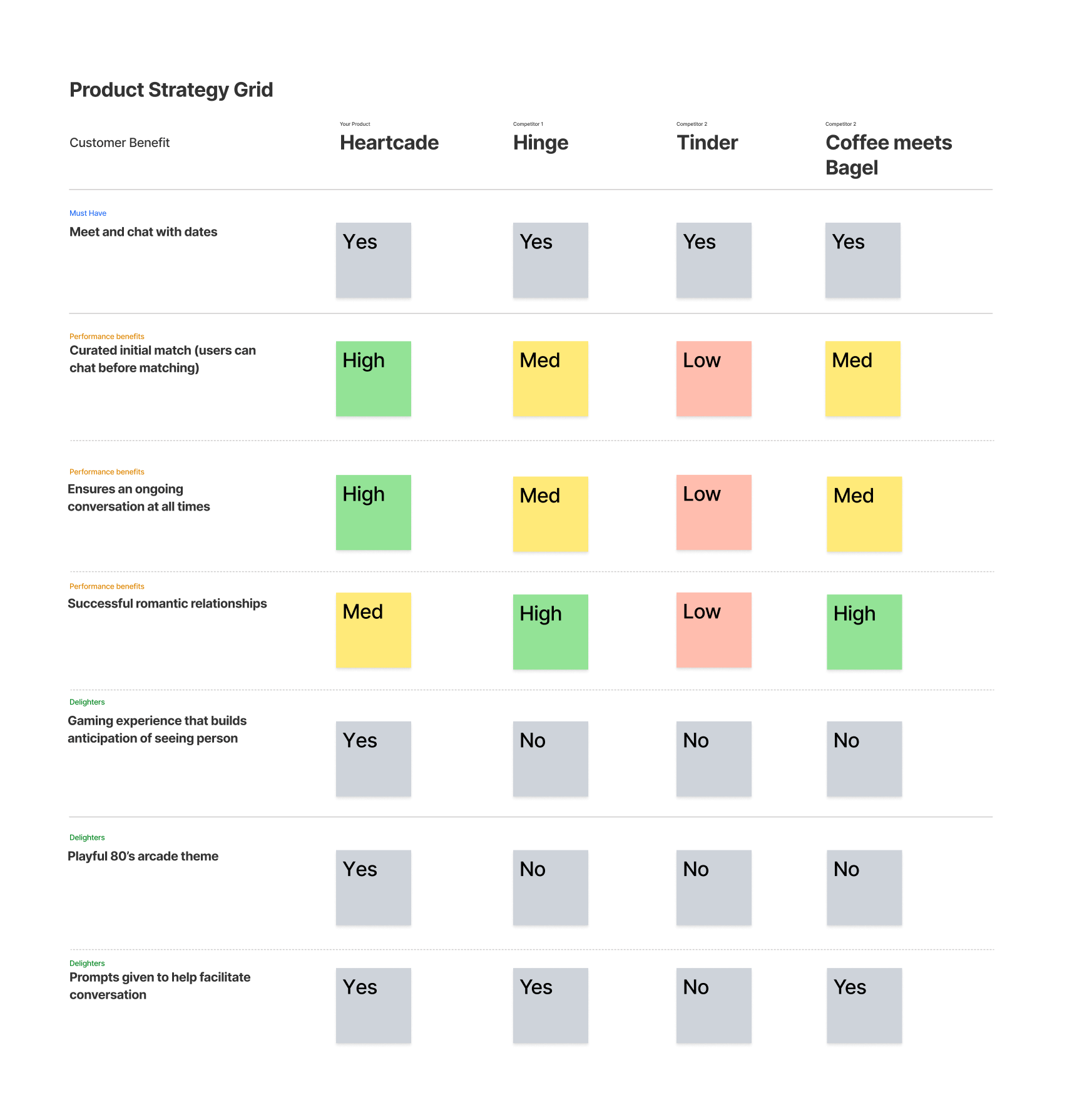
This was due to its simpler nature, which would allow the developing team to focus on setting up the framework. Below was an outlined strategy:
BETA 1
Proposed Structure & Flows
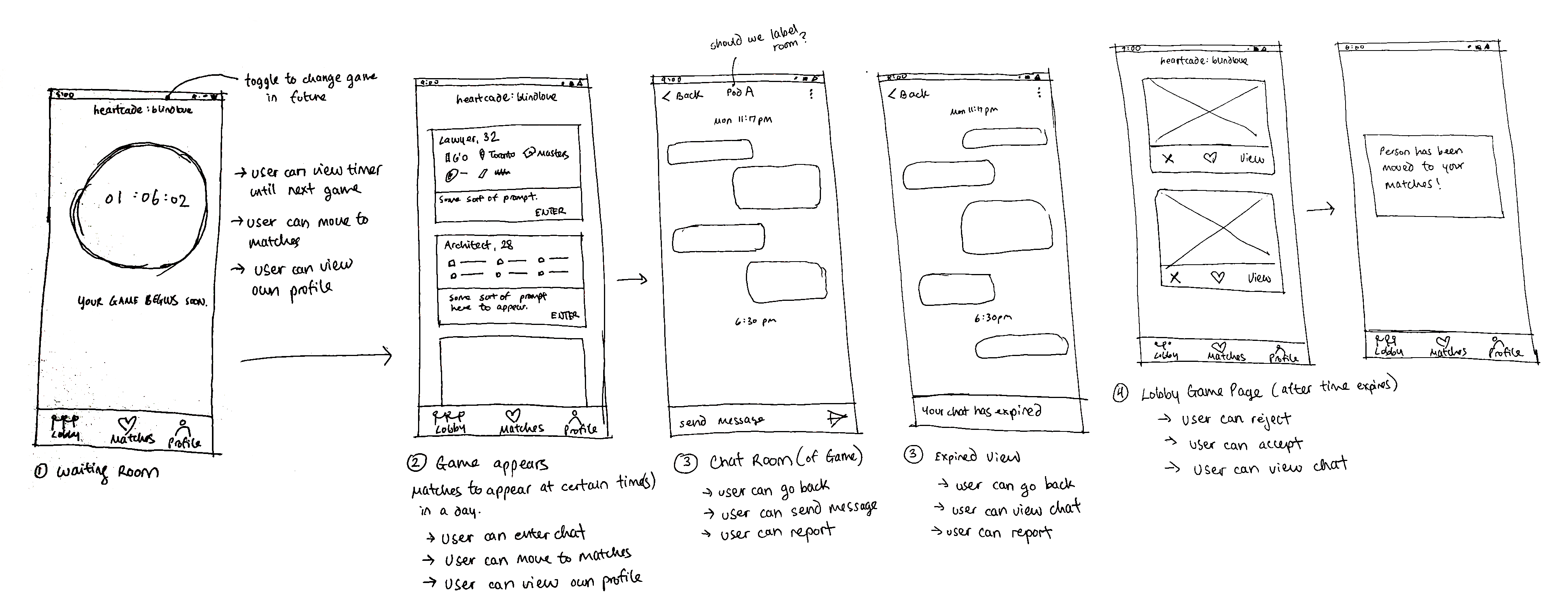
With the product strategy in mind, I proposed three main pages on the mobile app. My process usually involves quickly sketching before drafting a mid-fidelity version. I felt like this was effective because I was able to show the team to gain their feedback. In addition, I used material io as the base system when designing the components of the app.
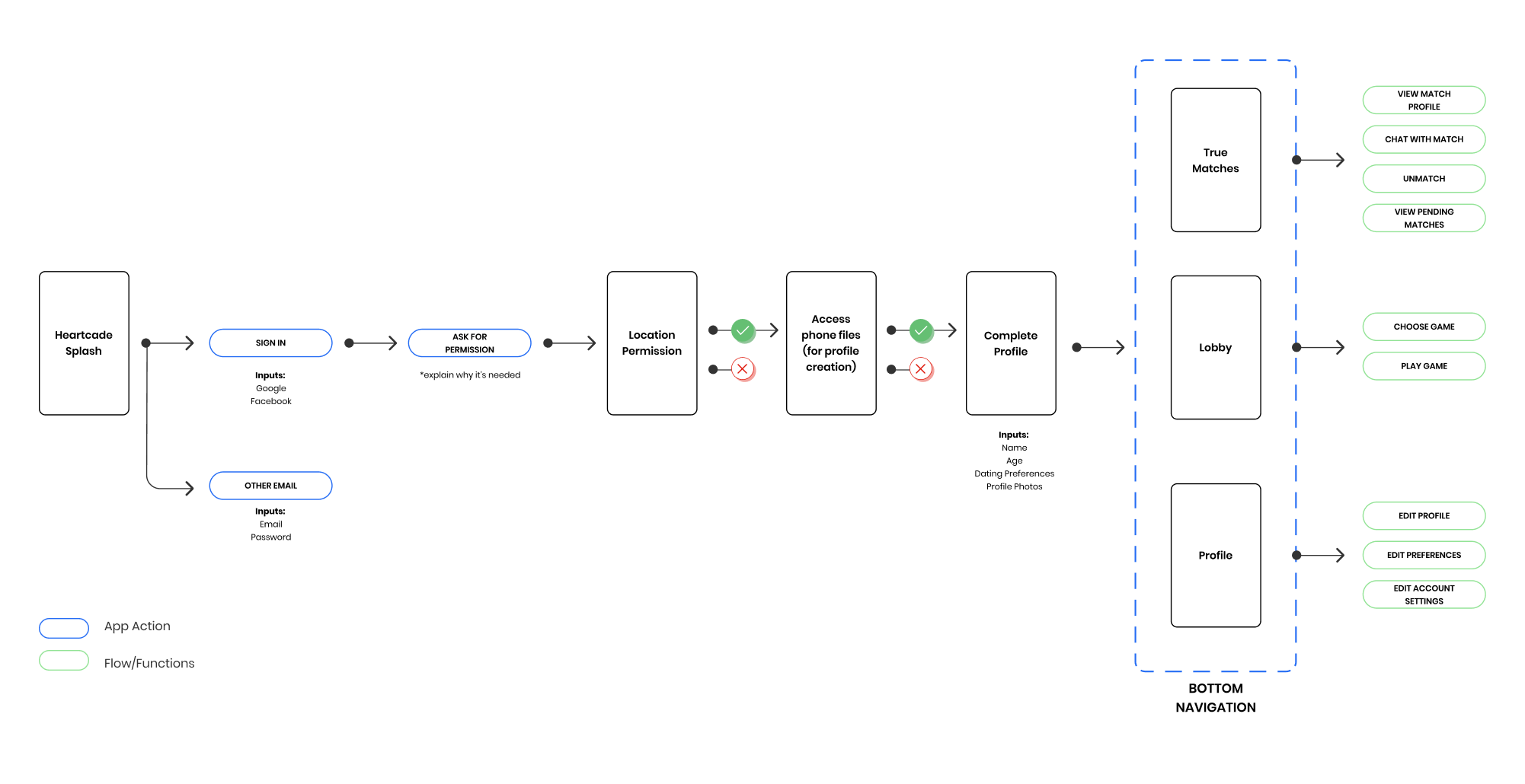
Sketch of Game Flow
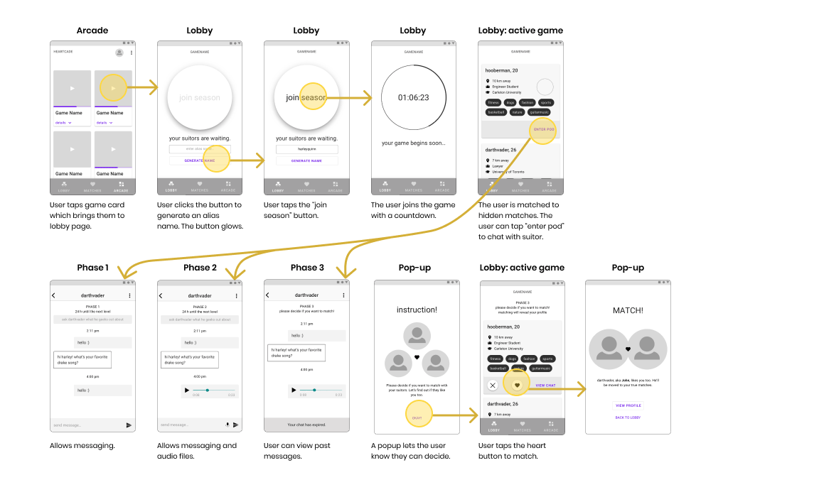
Mystery Date is a season-based game, where a user joins after picking an avatar and alias. The more time that passes, the more interaction levels are available. The game contains three phases, where each phase increases interaction.This creates excitement and builds anticipation for the user to finish the game season.
Wireframe 1
Using an iterative process, I went through two wireframes before working on the UI. The first wireframe was evaluated with a usability test with 5 representative users. Users were able to freely voice their thoughts as they walked through some typical user tasks.
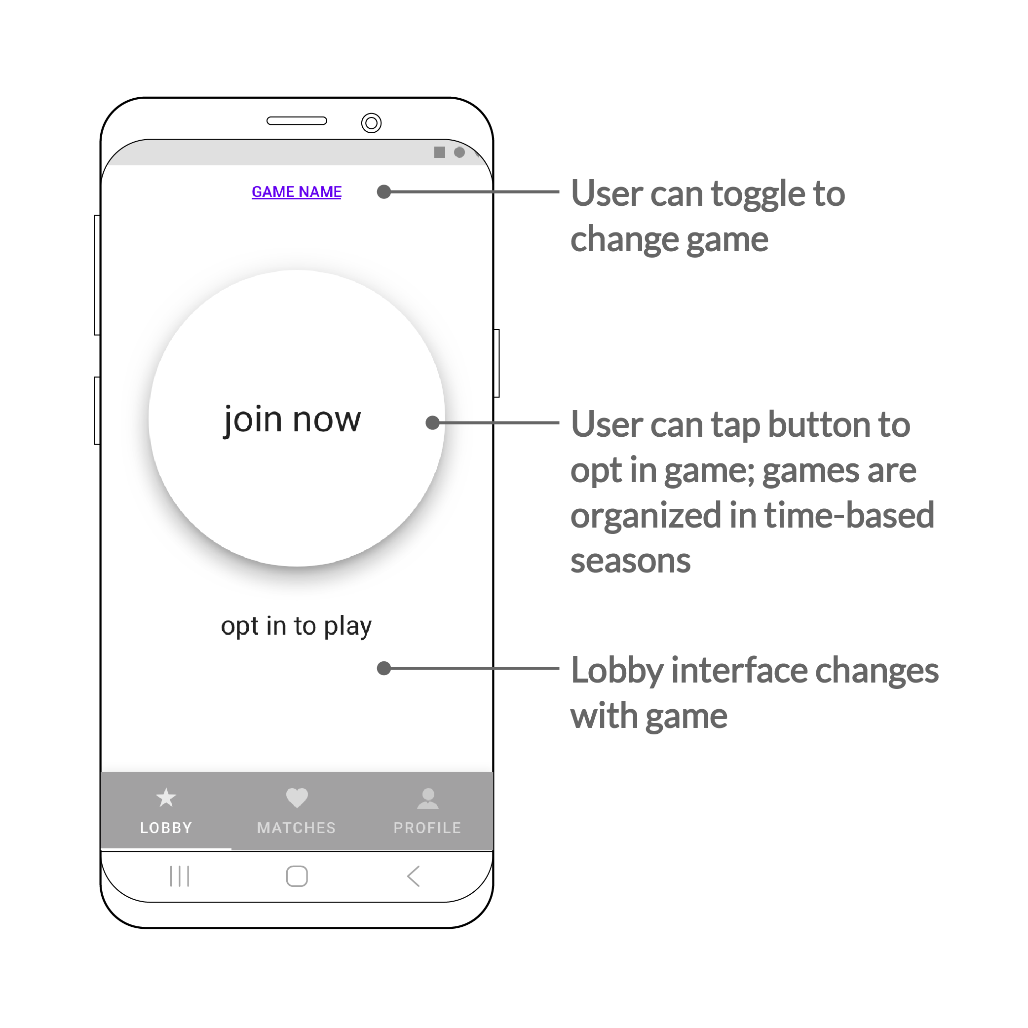
LOBBY
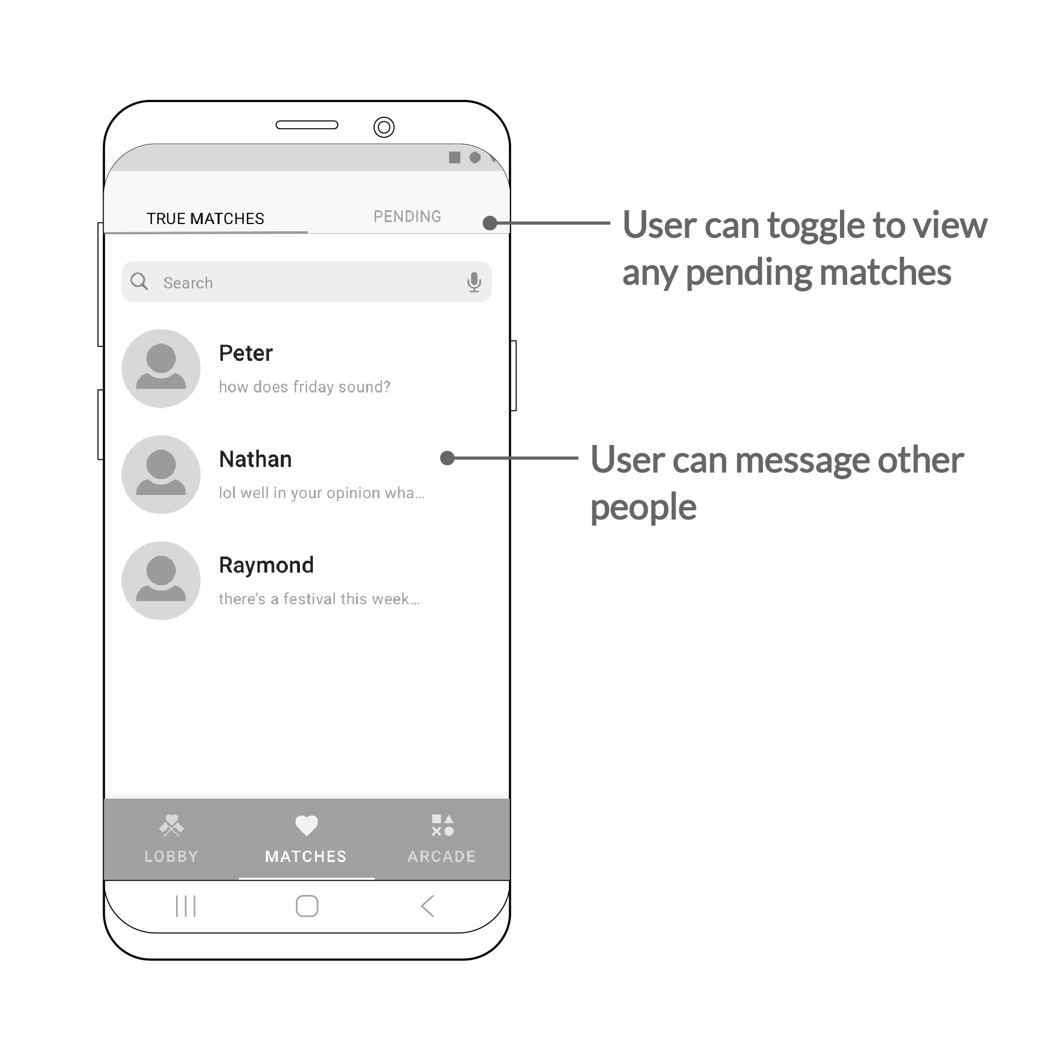
TRUE MATCHES
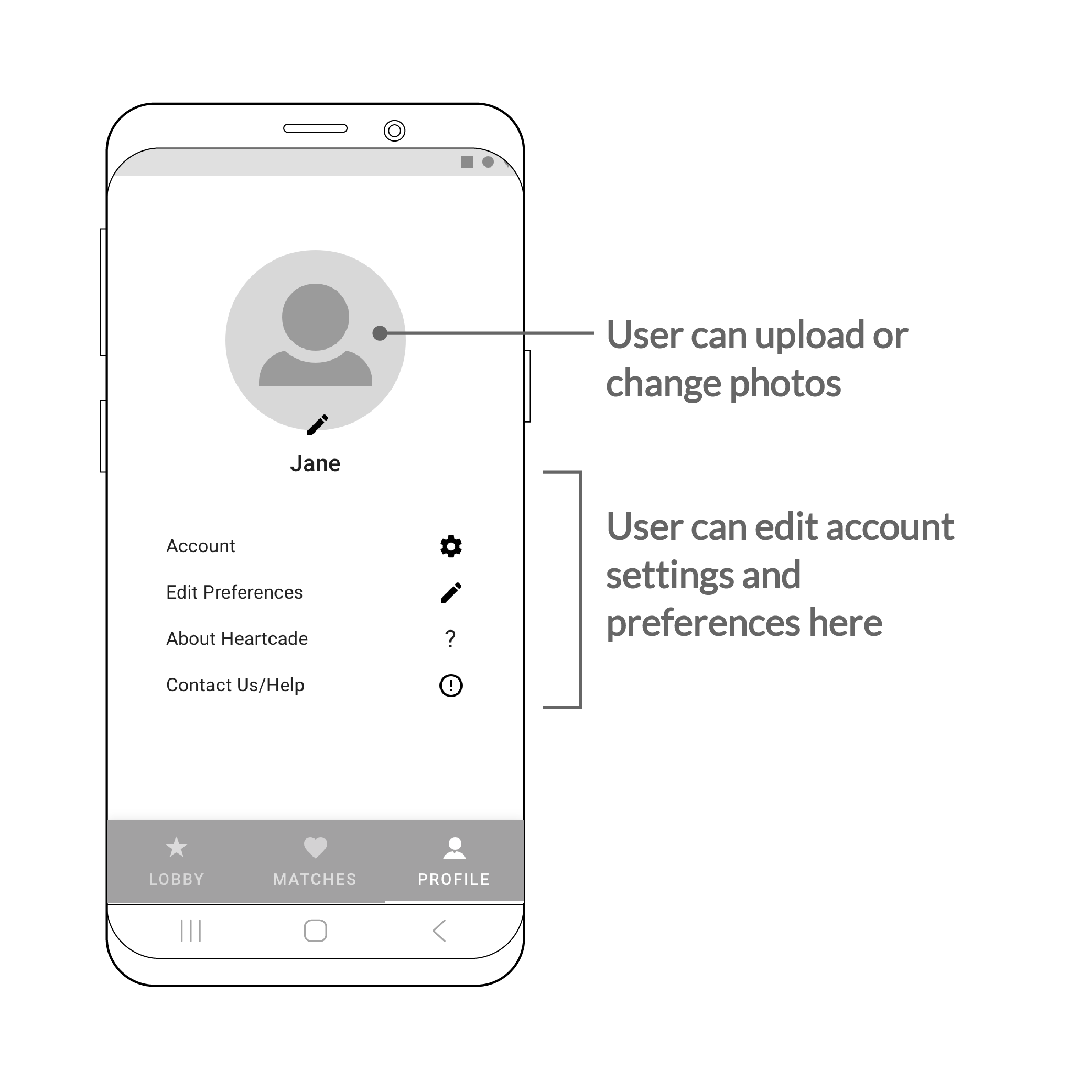
PROFILE
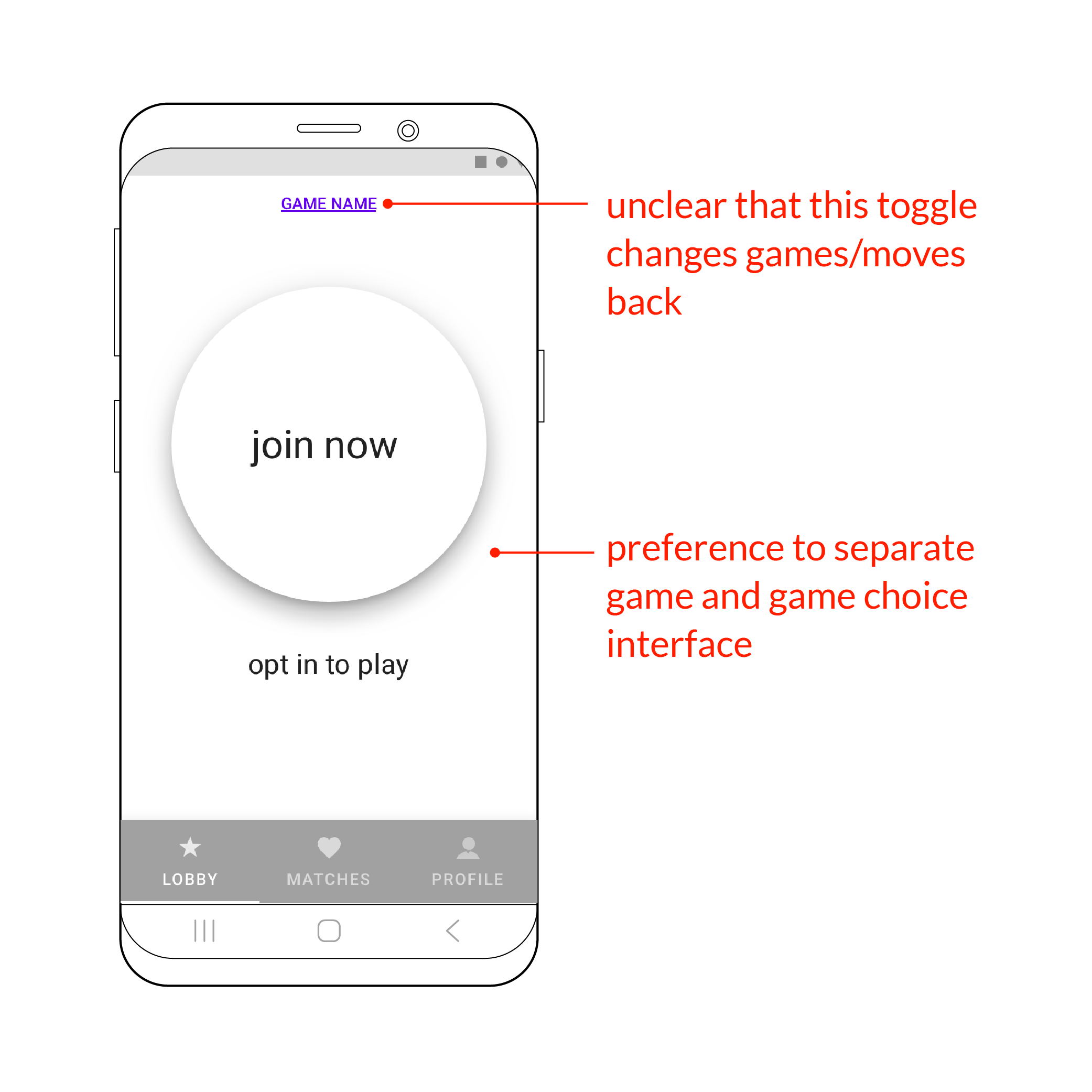
Key finding: Unclear toggle
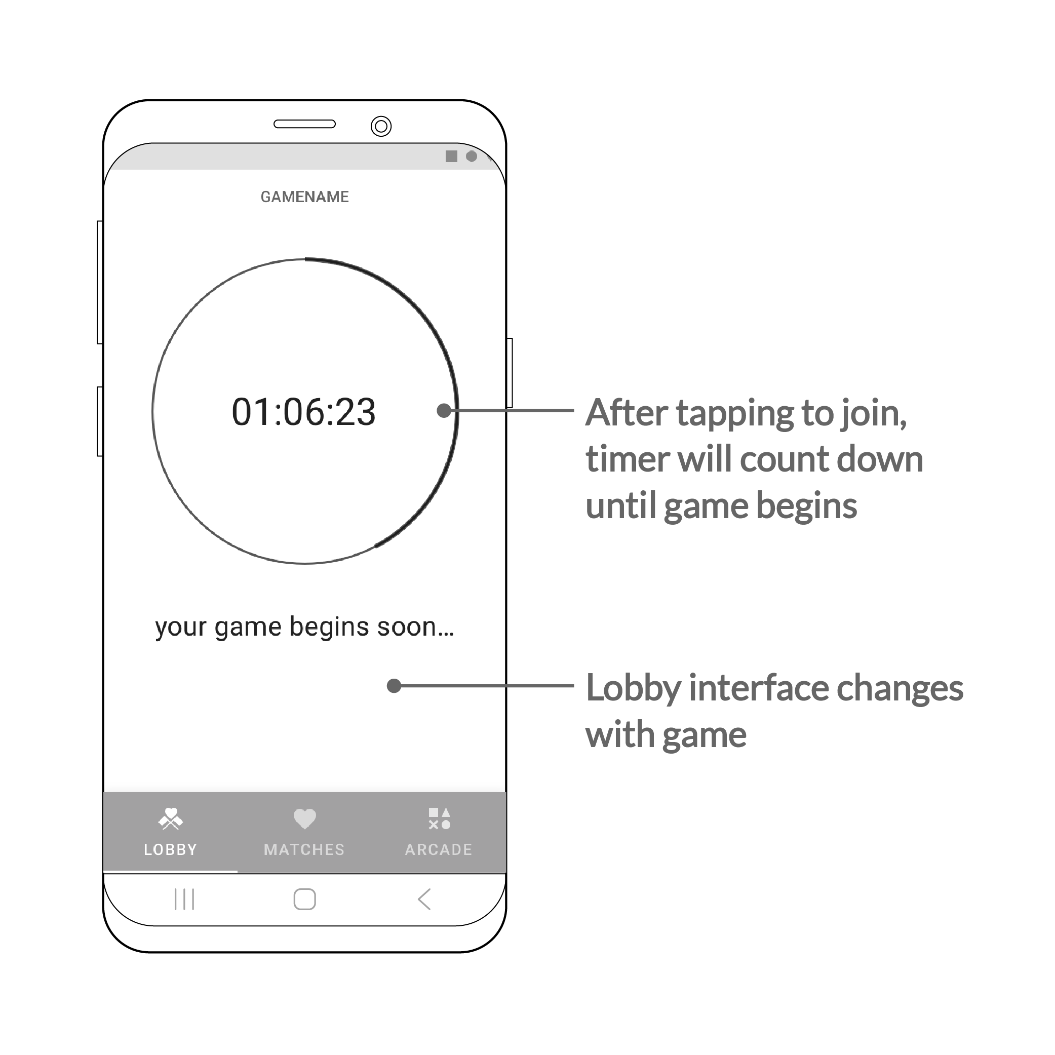
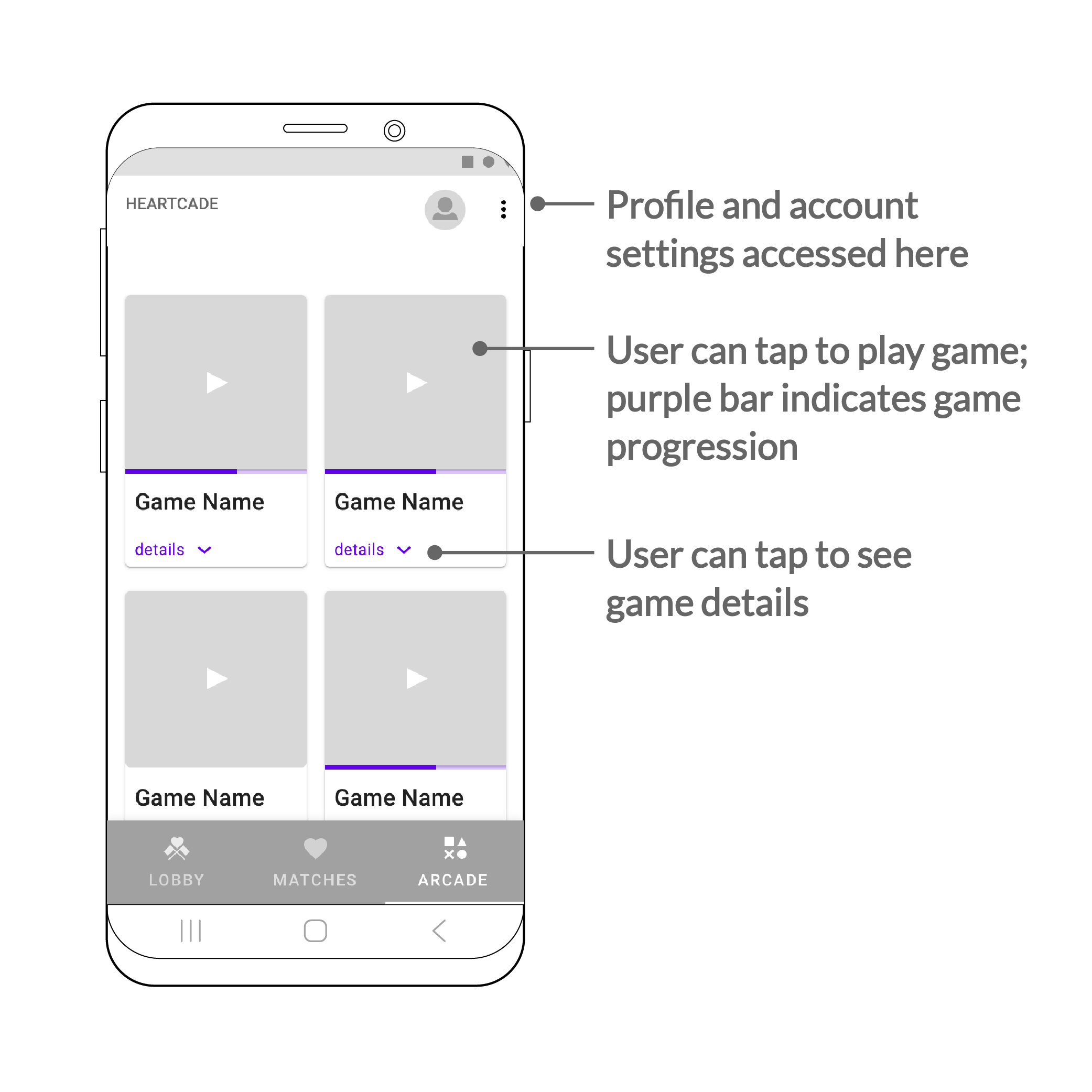
Users were confused with the “game choice” and “game play” being on the same page. As a result, the game choice was separated from game play.
Wireframe 2
LOBBY

TRUE MATCHES
ARCADE
BRANDING & UI
Bringing Back Arcade Nostalgia
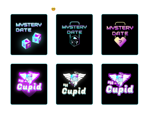
By working with the founder, I captured her vision while embedding my own creative interpretation. With gamification as the main concept, the art direction became a modern take on 80’s arcade games + early Microsoft.
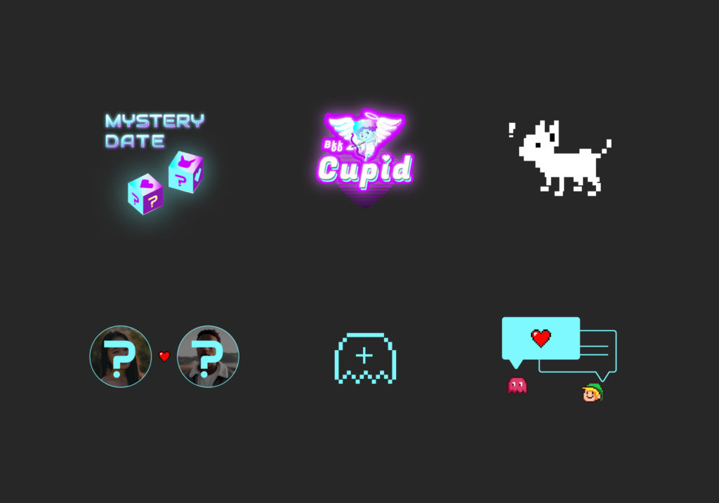
CONCEPT
A modern take on 80's arcade games + early microsoft.
UI Components
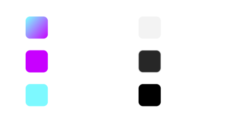
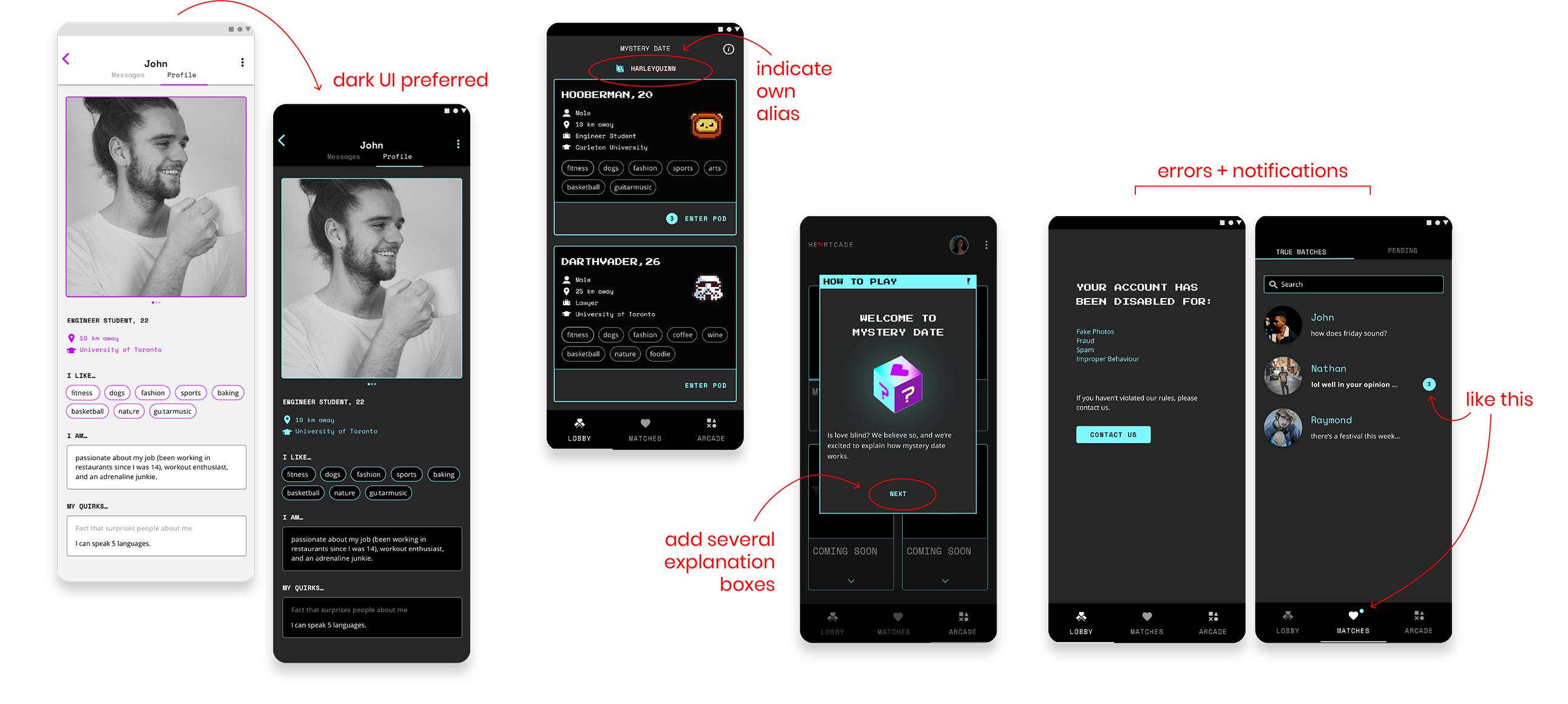
Electric blue and purple were the theme colors, reflecting the 80’s arcade era. The contrast on the dark interface meets WCAG requirements too. I proposed a dark and light UI to distinguish between the game and real life. I enjoyed seeing how the app began to take a visible presence!

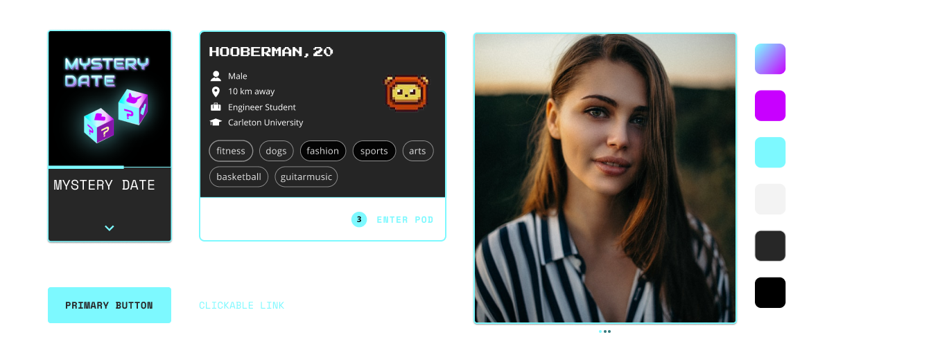
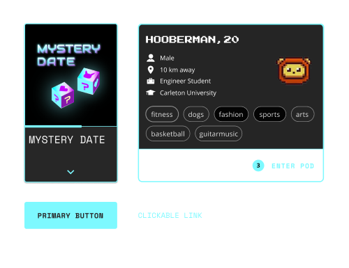

Test & Results
After iterating several versions with the PM and founder, the first set of UI was created. The first beta launch was ready to test, and the marketing team invited 80 university students. The feedback was overall positive, and some of the findings included:
BETA 2
Increase User Engagement
Arcade to include an internal economy
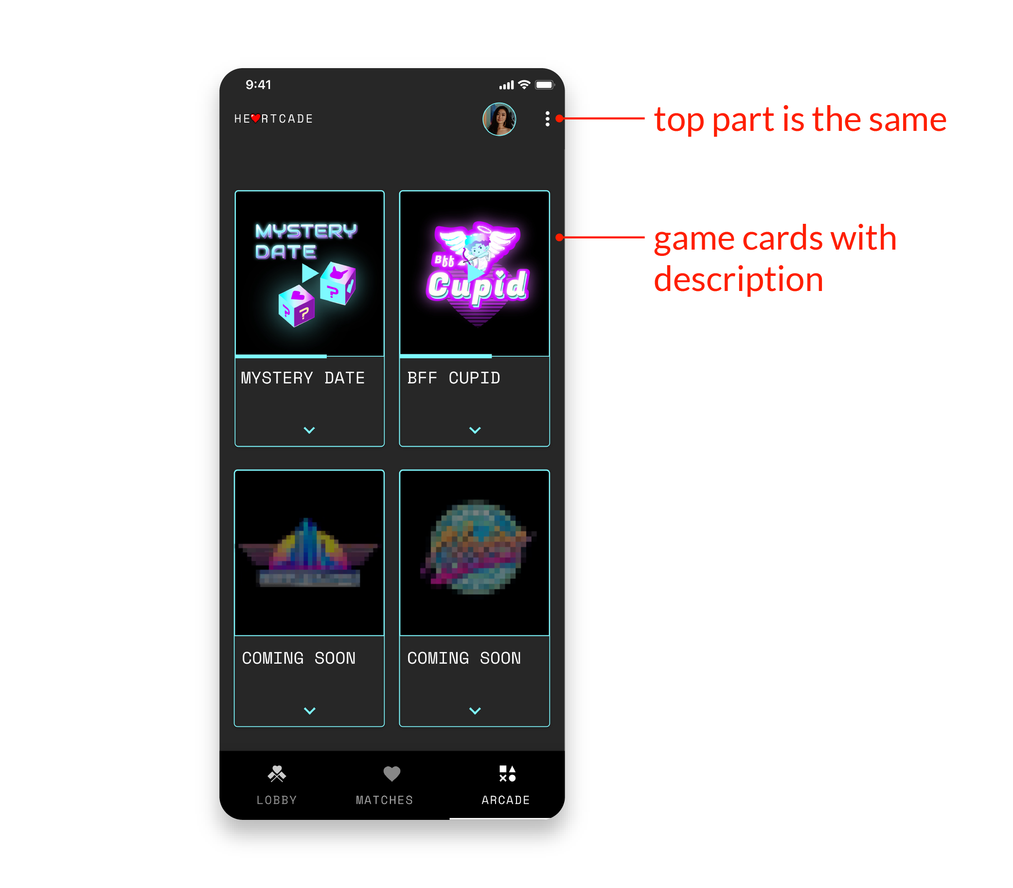
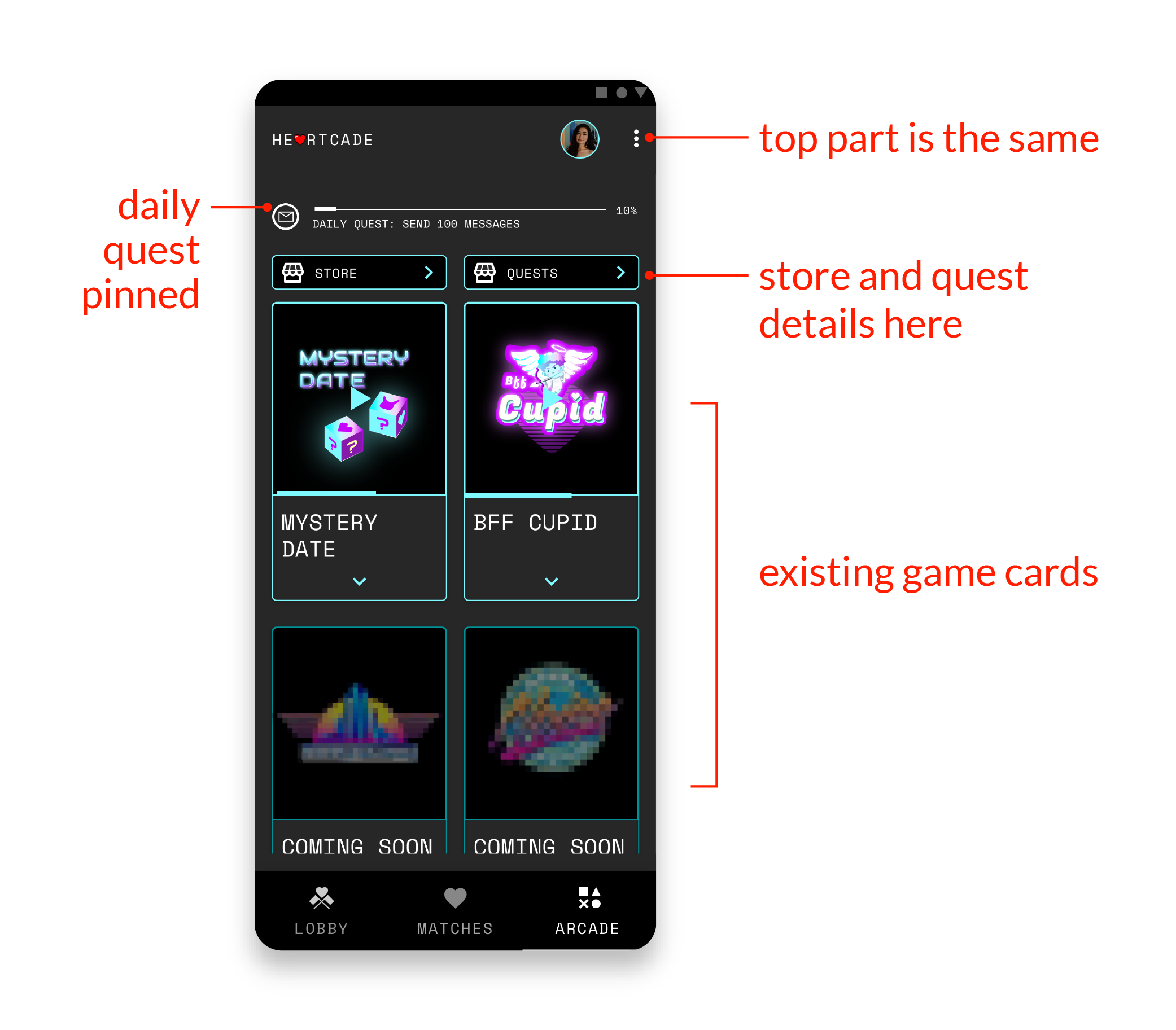
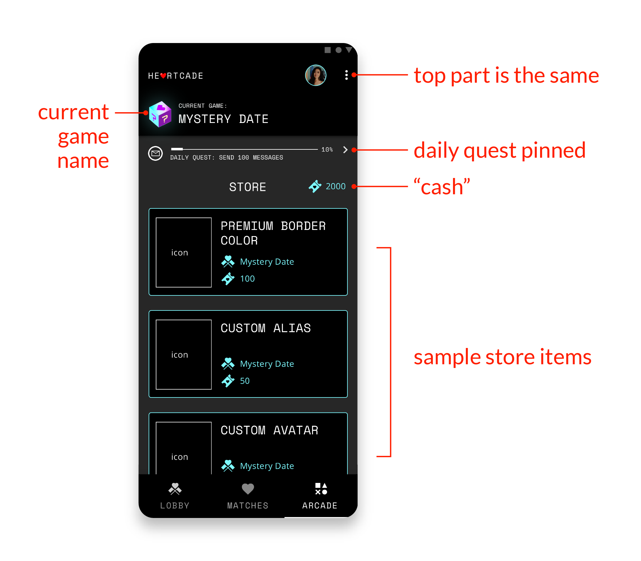
While I liked the ‘arcade’ concept, the page itself had a low engagement. We decided to add an internal economy to the arcade page, as a strategy to increase interaction and incentivize in-app actions. Users were given quests to earn points, which could be used to purchase game items.
It created a core loop and gamified the app.
With several iterations of the new arcade, I wanted to see which one was most engaging. We asked users to play the season when presented with the two versions. After testing on 8 users (4 each), the storefront version had almost two times more engagement with the store items or quest than the one with the arcade cards.
BETA 1
VERSION 1
VERSION 2
Second Iteration
In the second release, I was happy to see that the engagement increased significantly (3000 to 11,000 messages sent) under the same number of invited students. The quest prompts and economy were very effective.
SOLUTION
Let's play!
Joining a Game
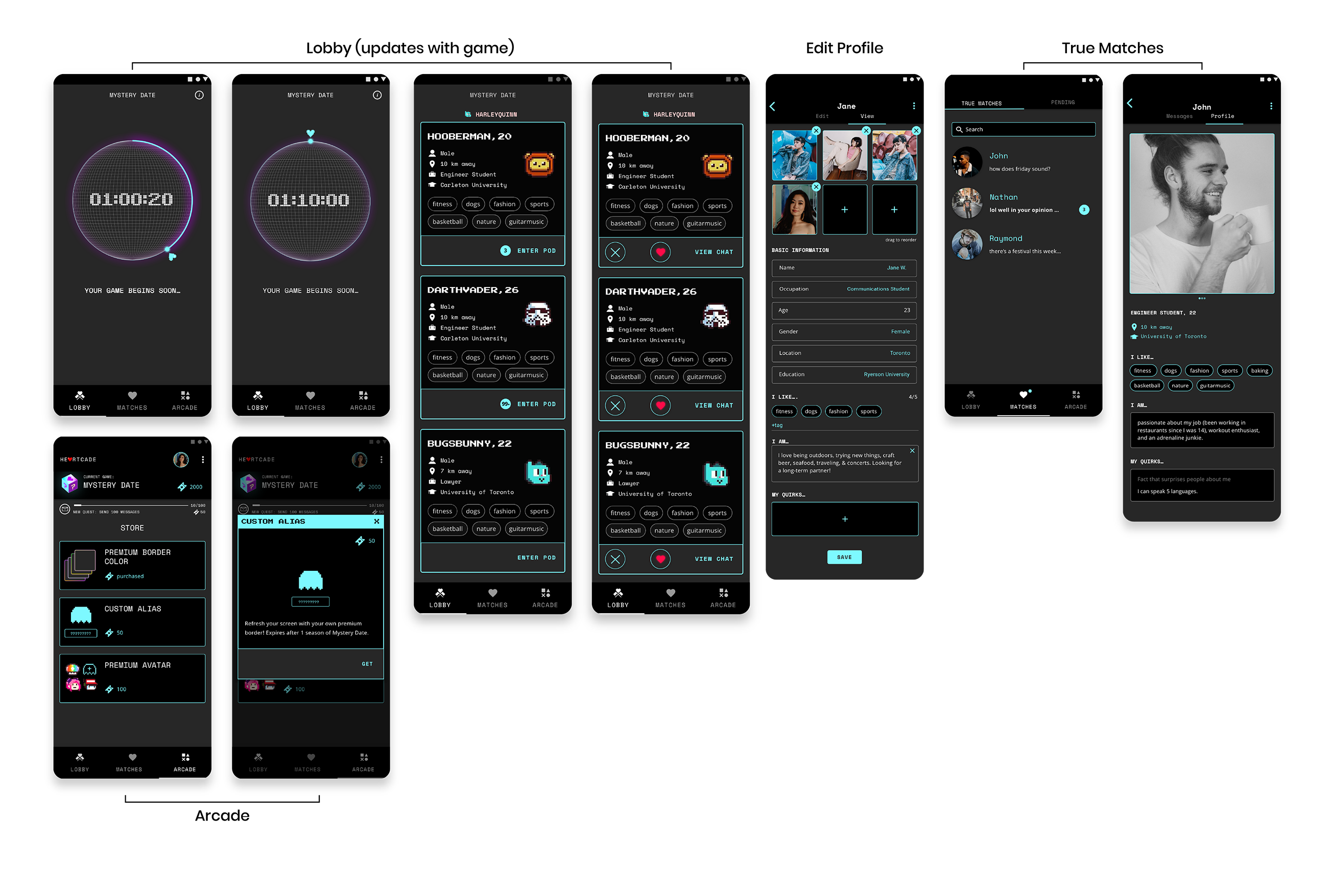
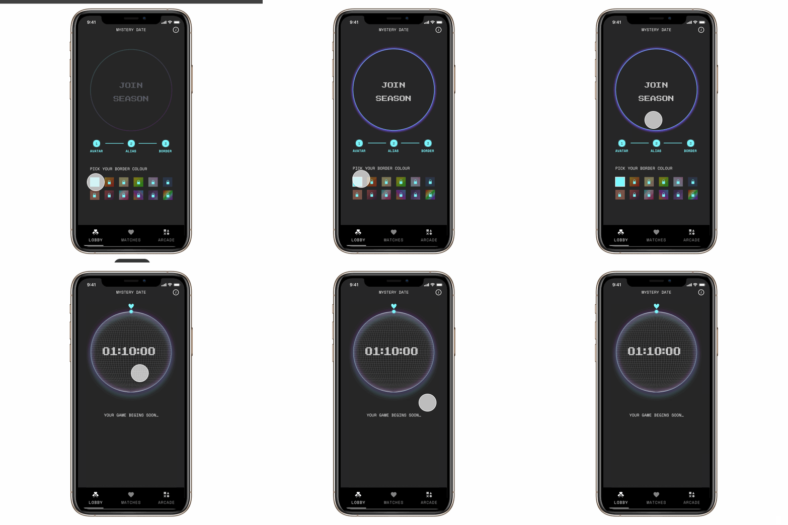
Play by joining a season on the lobby page.
Win a "True" Match
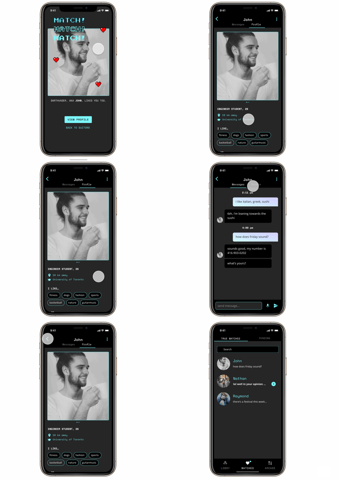
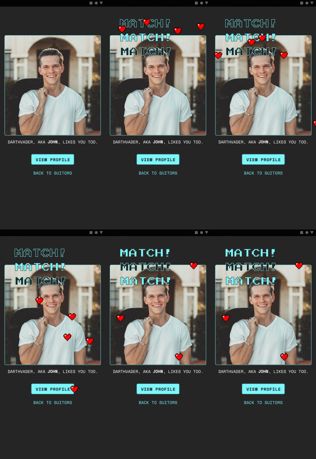
Play game to know your suitor better. Deciding to match will move your suitor to your true matches.

Continue the Relationship
Check out your true matches’ profile and message them.
Complete Quests
Earn tickets after completing daily quests. Popups will appear to encourage you!
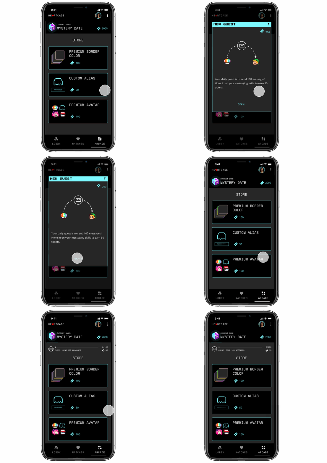
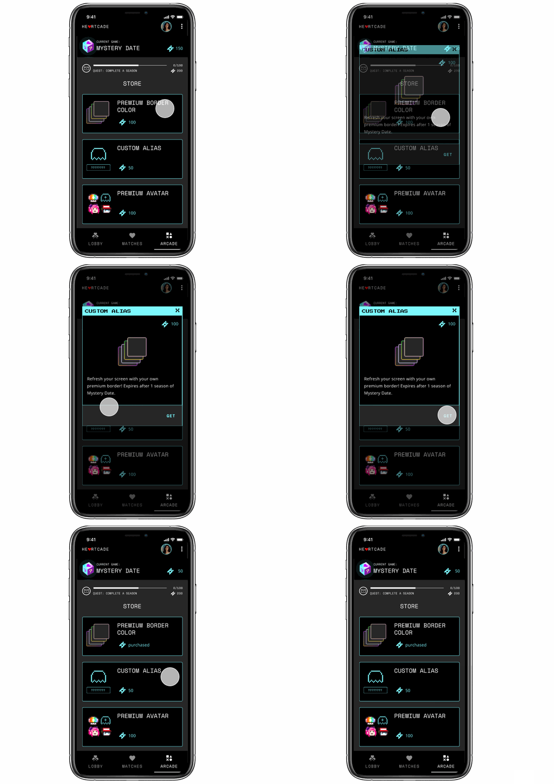
Buy Game Items
Purchase game items with earned tickets.
Splash

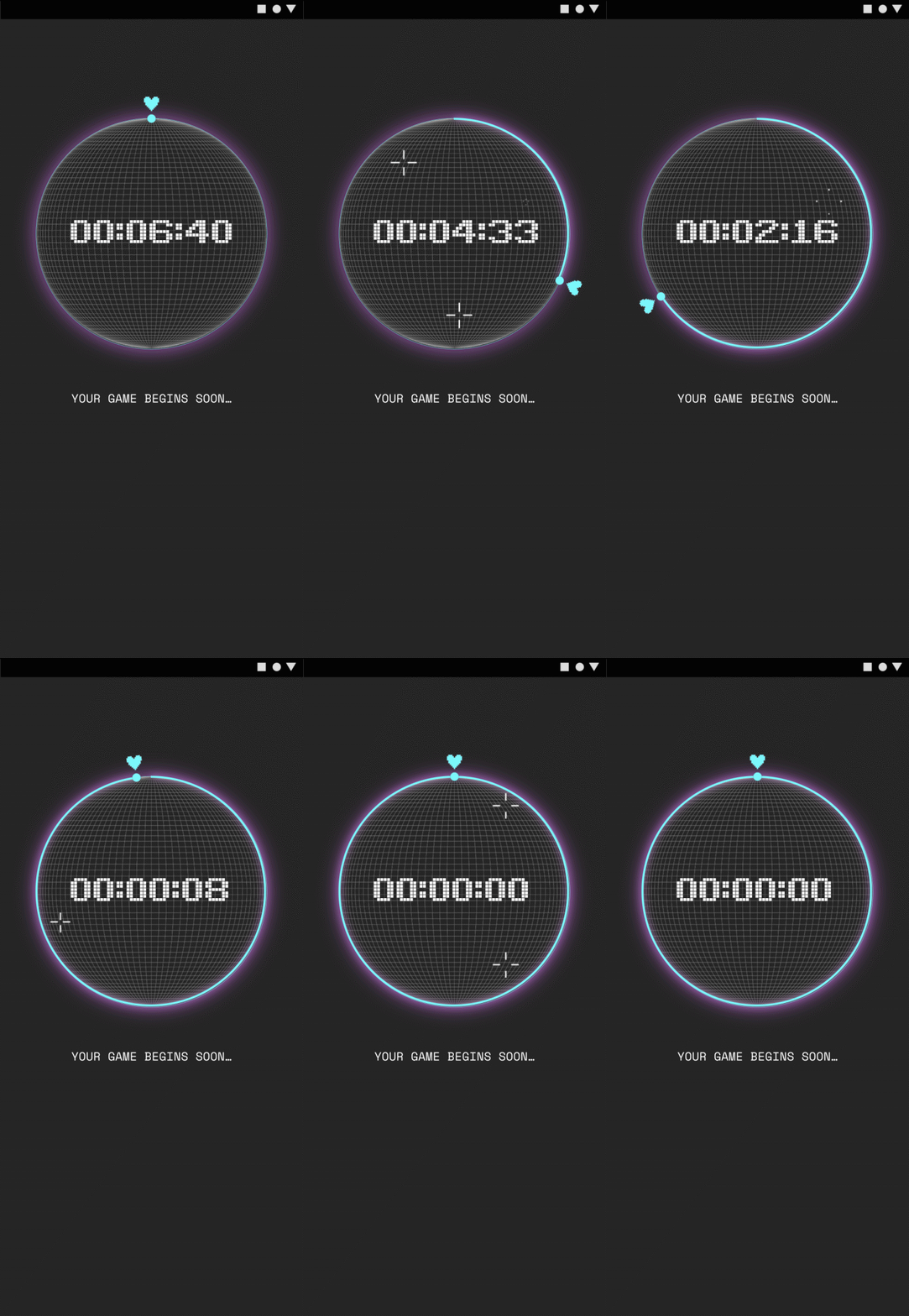
Timer
Match
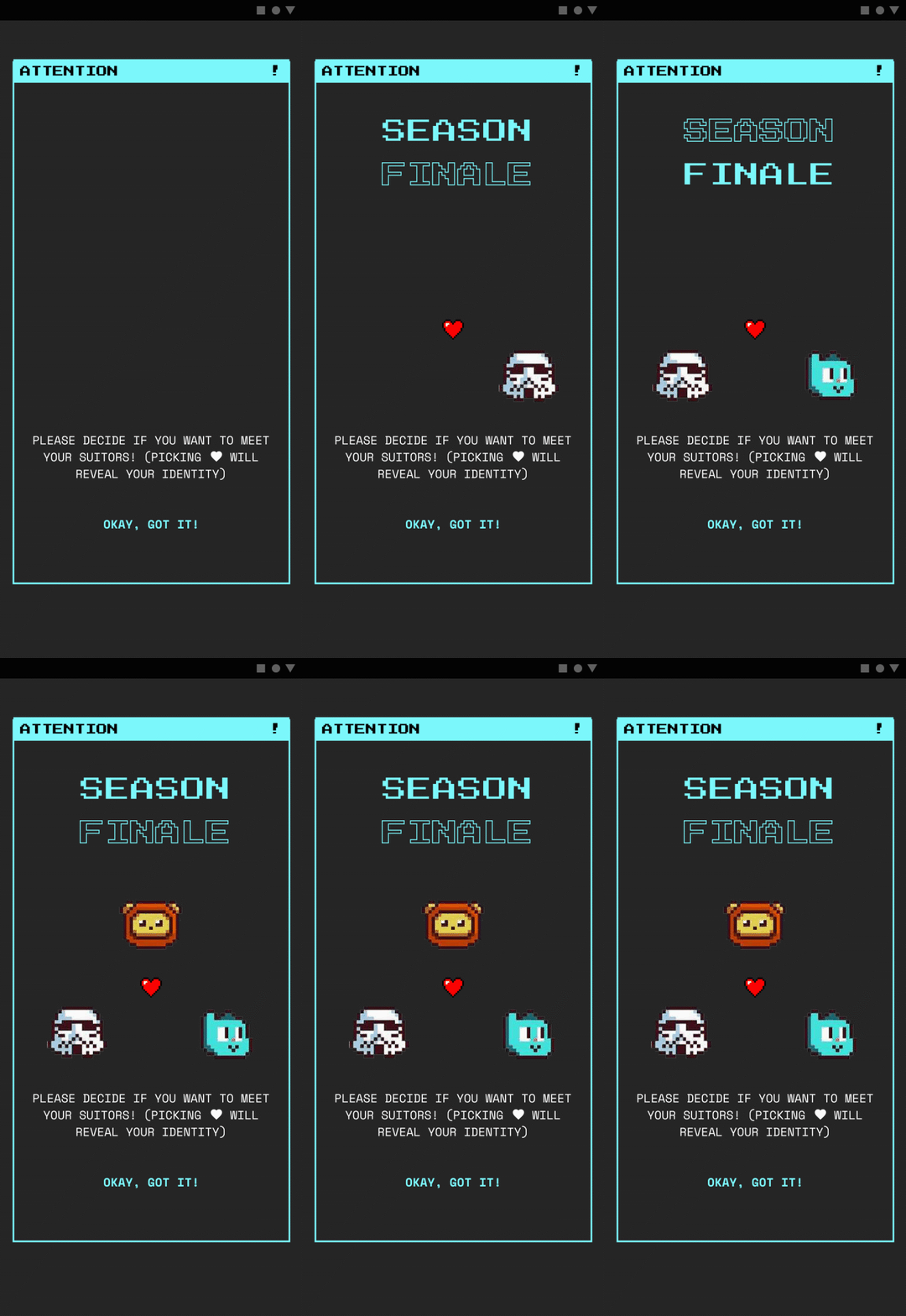
Season Finale
REFLECTION
Learning Outcomes
I learned about the process of creating a phone app and the planning that goes into its design. Though challenging, it was a fun project.
My greatest challenge was forming a working rhythm at the onset. This is because of remote working and having wider responsibilities. (ex. being asked to suddenly prepare a VC presentation). It was a proactive role with overlapping responsibilities. I’m still thankful for a team that was gracious to my ability.
What surprised me was the constant change from testing. The storefront version was more engaging than gamecards. After redesigning the arcade for Beta 2, the engagement increased over 3x to 11,000 messages. The feedback loop reallyhelped in making objective decisions.

Next Steps
I designed until Beta 2. If I continued, I would:
- Refine game onboarding flow
- Read up on game theory its psychology
- Consider future store and quest items
- Test UI
Next Project
Bossify
