Historic Places is a database for all of Canada’s designated heritage properties, allowing users to find related documents to a specific property. This redesign addresses its current difficult-to-search function by improving the website’s organization and visual design.
Role:
UX Research & Design
Rundown
Team: 3 people
Project: Website Redesign
Time: Fall 2020 (5 weeks)
To make it easy for users to find a property’s information (status, links, or technical files). Another goal was expanding the user base to include both architectural heritage professions and the general public.
Solution:
We redesigned the information architecture of the site based on the mental models of the primary and secondary users uncovered through research. I was responsible for creating the visual design relying on precedents from the architecture profession.
SOLUTION PREVIEW
INITIAL FINDINGS
Stakeholder Goals and Wants
We first wanted to see what was in place before working on the redesign, since it’s important to understand the good and the bad before proposing something new. Fortunately, the website manager was open to being interviewed and we were able find high-level goals, user types, and current problems.
Client Goal:
Recognize historic places and foster their continued protection for future generations. To support this goal, they have created the most comprehensive platform for all the historic places in Canada
Wants:
To make tools more readily available as a “one-stop” destination, to increase educational ability (particularly for general public), to increase casual traffic
Questionnaire
Afterwards, we conducted primary research to evaluate the website. From 22 survey responses and the website manager, we determined 3 user groups.
Most Useful
Searching the Canadian Register (15 people)
Standards & Guidelines (12 people)
Downloadable Resources (8 people)
Least Useful
For Kids (10 people)
Site Map Page (7 people)
Social Media and Affiliated Partners (6 people)
User Types:
USER INTERVIEWS
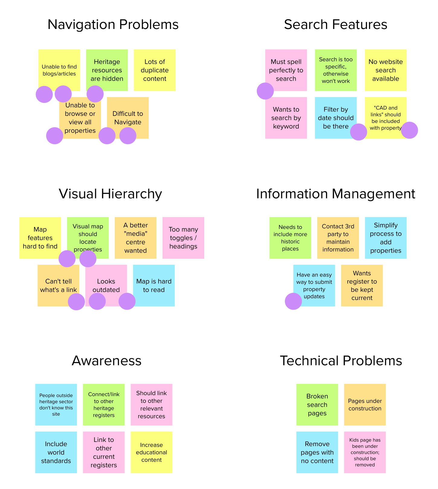
Understanding Pain Points
To determine the problems with the existing website, we performed user research by talking to 5 people. Participants recruited fell under the first and second user groups (professionals in architectural heritage or those seeking to designate a site).
PARTICIPANT 1
“I usually open other websites too, even though this has everything. It’s just easier to scan.”
Problem 1: Weak Visual Hierarchy
PARTICIPANT 2
“I’ve never noticed the resources! It’s hard to find stuff, some headings are duplicated too.”
Problem 2: Unclear Navigation and Organization System
PARTICIPANT 4
“I don’t get what is clickable and what isn’t”
Problem 3: Inconsistent system standards
Affinity Diagram
Problem 1: Weak Visual Hierarchy Problem 2: Unclear Navigation and Organization System Problem 3: Inconsistent system standards
Affinity Diagram
Meet our Users
Based on interviewing the website manager and the survey findings, we determined the three main user groups.
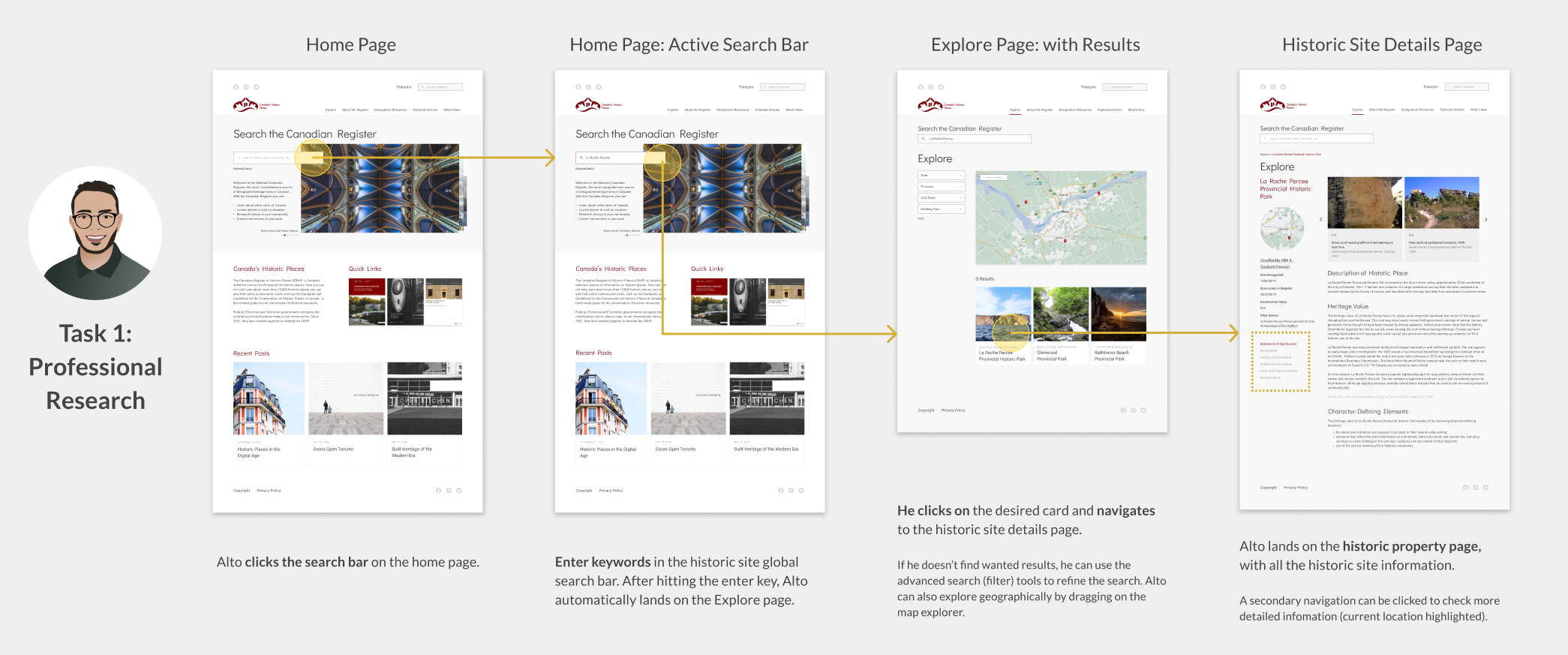
Alto the Architect
Alto is an architect who received a project to design an addition to the Notre Dame in Montreal. Alto knows that there are restrictions to altering historic sites, and wants to make certain his design abides by the heritage laws. He uses historicplaces.ca to see what changes are permitted.
Rationale: The primary user group are professionals in architectural heritage (i.e. architects, engineers, planners)
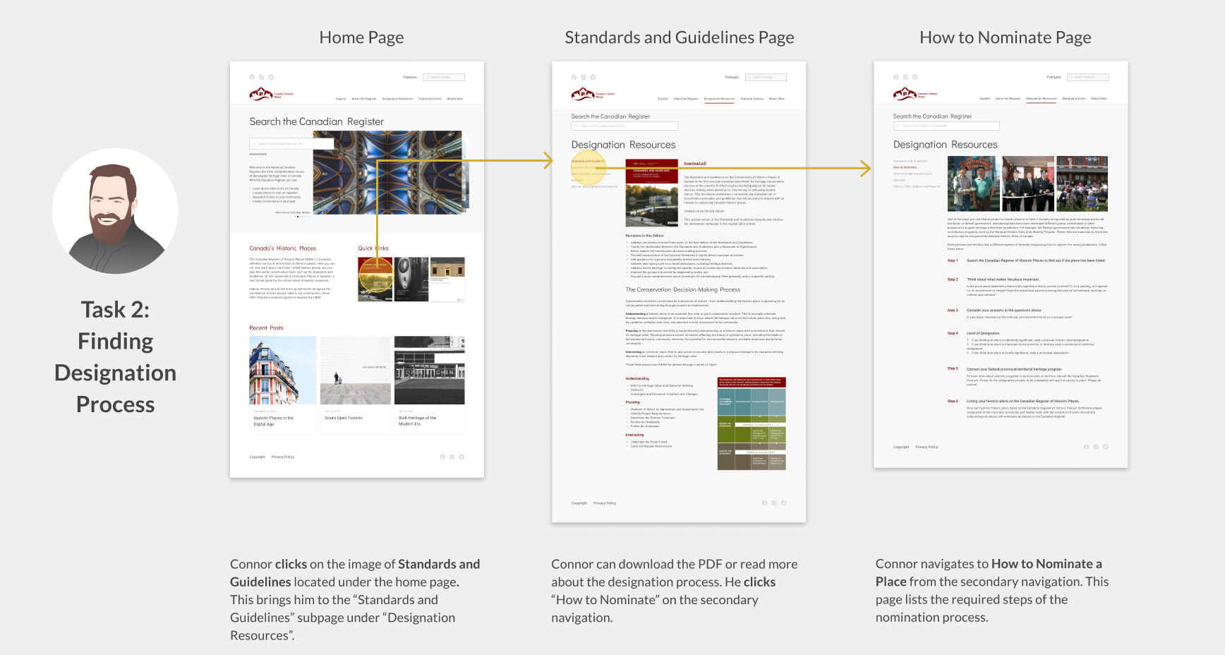
Connor the Community Head
Connor leads a community group in Ottawa. His neighborhood has the Deschatelets Building, a building which was an Oblates Seminary School in the 1800’s. Since the building is under development pressure, Connor wants to protect it. He visits historicplaces.ca to learn how to designate it.
Rationale:The second largest user group are people seeking to designate and protect a heritage property.
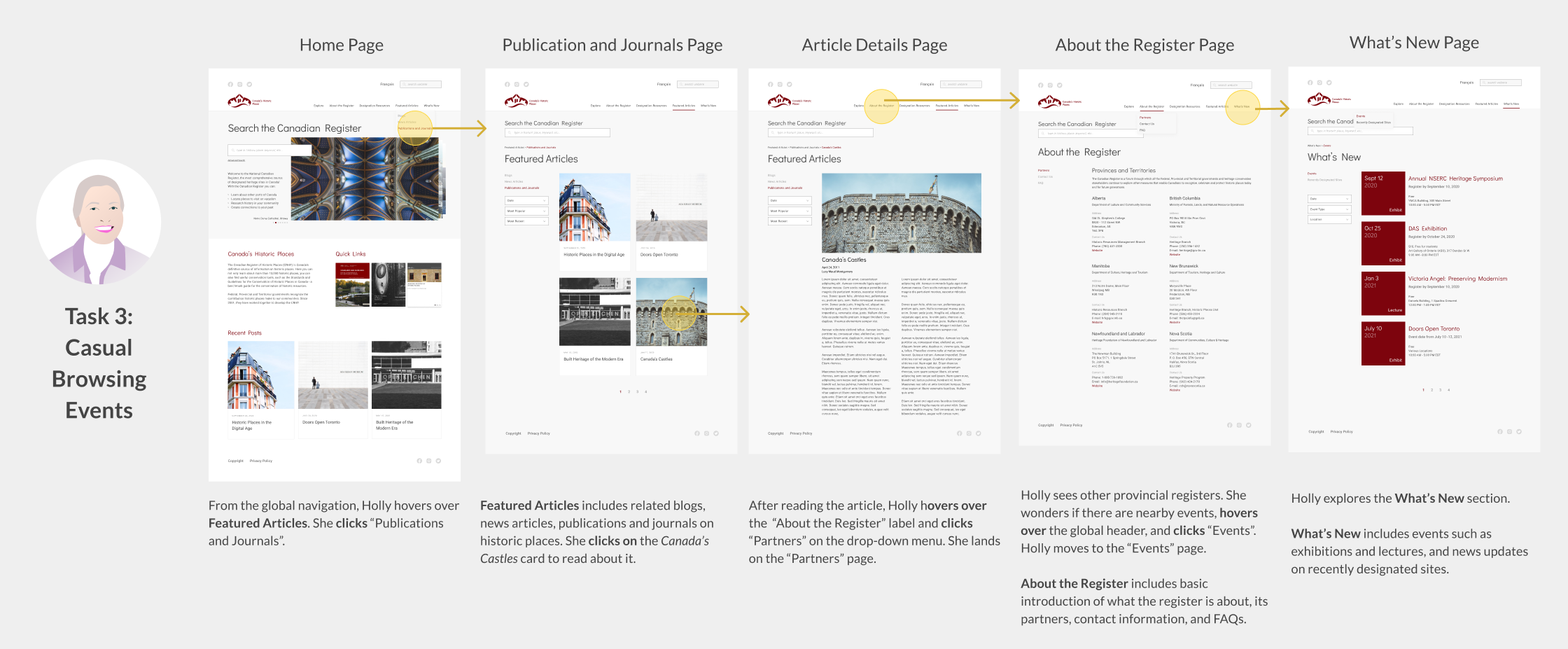
Holly the Heritage Enthusiast
Holly loves Canadian author Lucy Maud Montgomery (Anne of Green Gables). She knows Montgomery is from Prince Edward Island. She wonders if there are other places with a connection to the author closer to her. She visits historicplaces.ca to search properties or blogs related to Lucy Maud Montgomery.
Rationale:The third user group are people interested in tourism or architectural heritage.
IDEATION
Opportunities for Improvement
1
Large Prominent Search Bar
As the most important function, a user should be able to search a historic site wherever they are on the website.
2
Interactive Visual Map
As Canada’s national register, it should be visually easy to see heritage properties.
3
Global Website Search
Allow users to search other site elements and not just historic properties. For example, finding blog articles.
4
Information Architecture (IA) Restructure
A website organization restructure based on cardsorting. This ensures the 3 user groups will understand the labeling.
5
Secondary Navigation + Breadcrumb
This is to be introduced on all pages for users to clearly situate themselves. Date and Links was also a popular section request on the historic property page.
6
Date Filter
It goes without saying, a date filter is important for historic sites but wasn’t implemented.
DETERMINING MENTAL MODELS
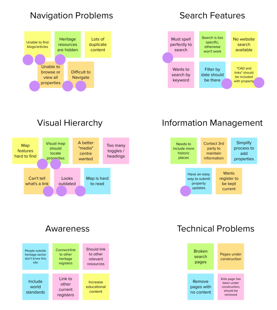
Organizing by Cardsort
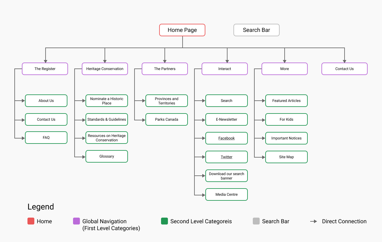
Of these 3 problems, the organizational structure (problem 2) needed further research to redesign. We made a hybrid cardsort in optimal workshop based on the survey findings to create understandable categories.
Test 1: Existing Structure
The first cardsort showed that the existing “Interact” and “More” categories were confusing and misleading. Few cards were sorted correctly under these categories.
Test 2: Proposed Structure
5 categories and 13 cards were created for the next cardsort. We removed cards that users didn’t find useful and renamed categories to be easily understood.
Existing IA
Existing IA
Proposed IA
Proposed IA
SKETCHES
Lowfi Storyboards
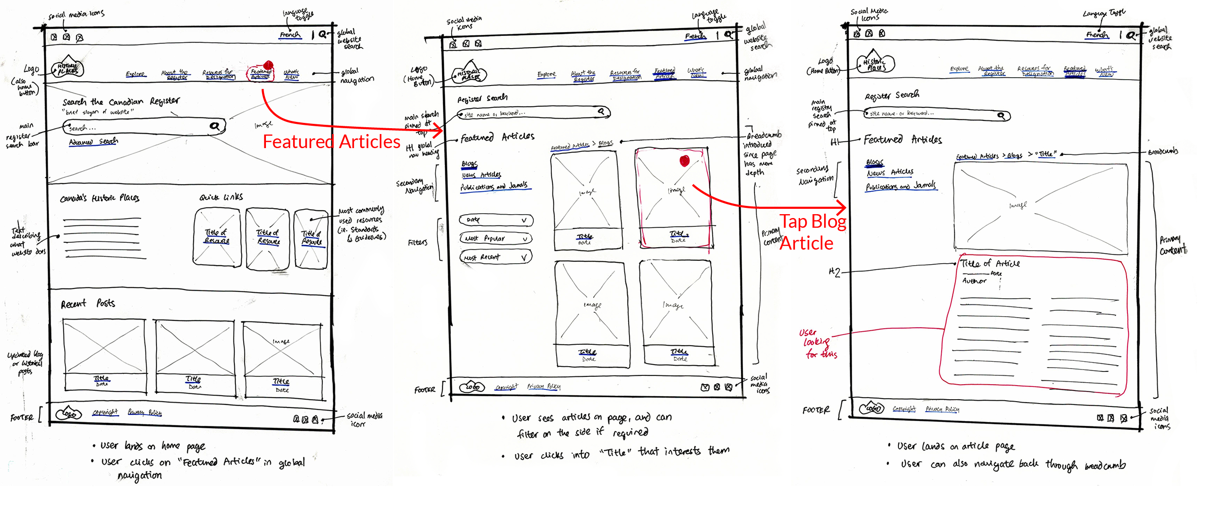
Using the new IA structure, I sketched low-fidelity storyboards to picture the use of the new design. Three main tasks were based off of our main user groups:
TASK:
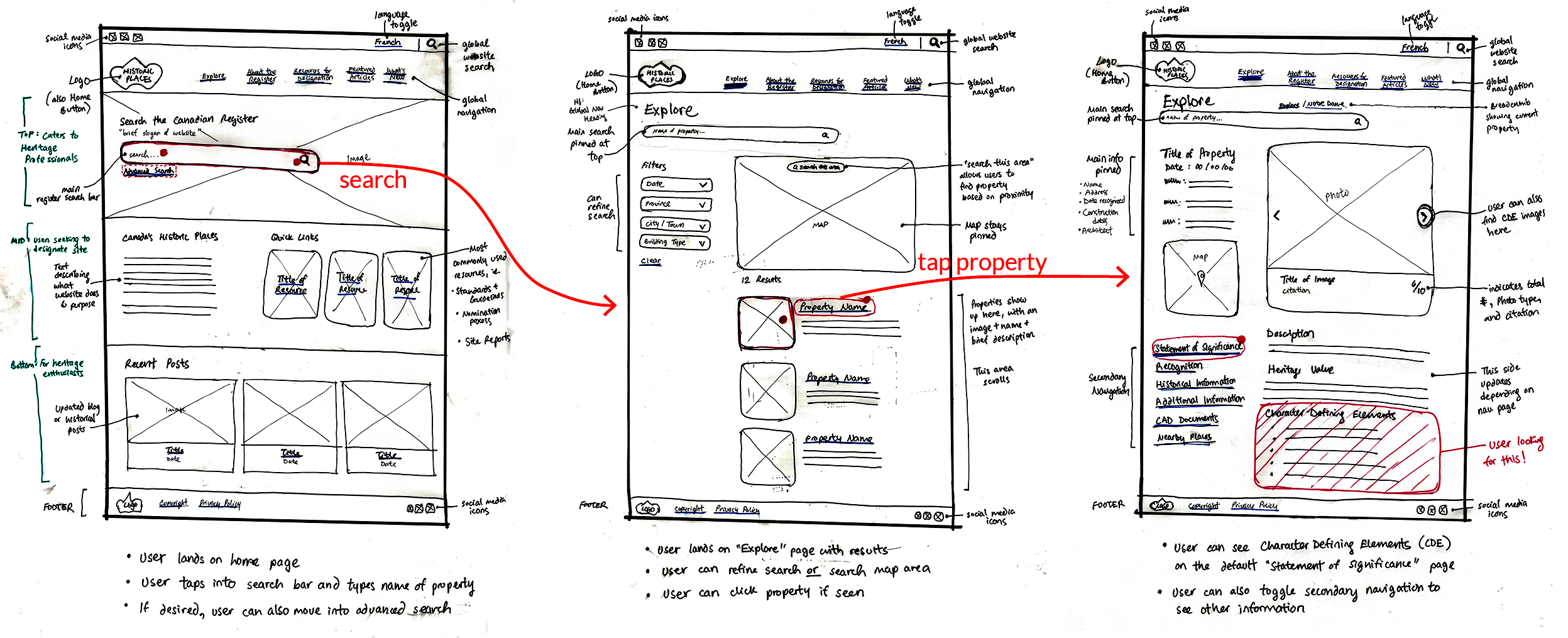
Identify the "Character-Defining Elements"
Identify Character-Defining Elements
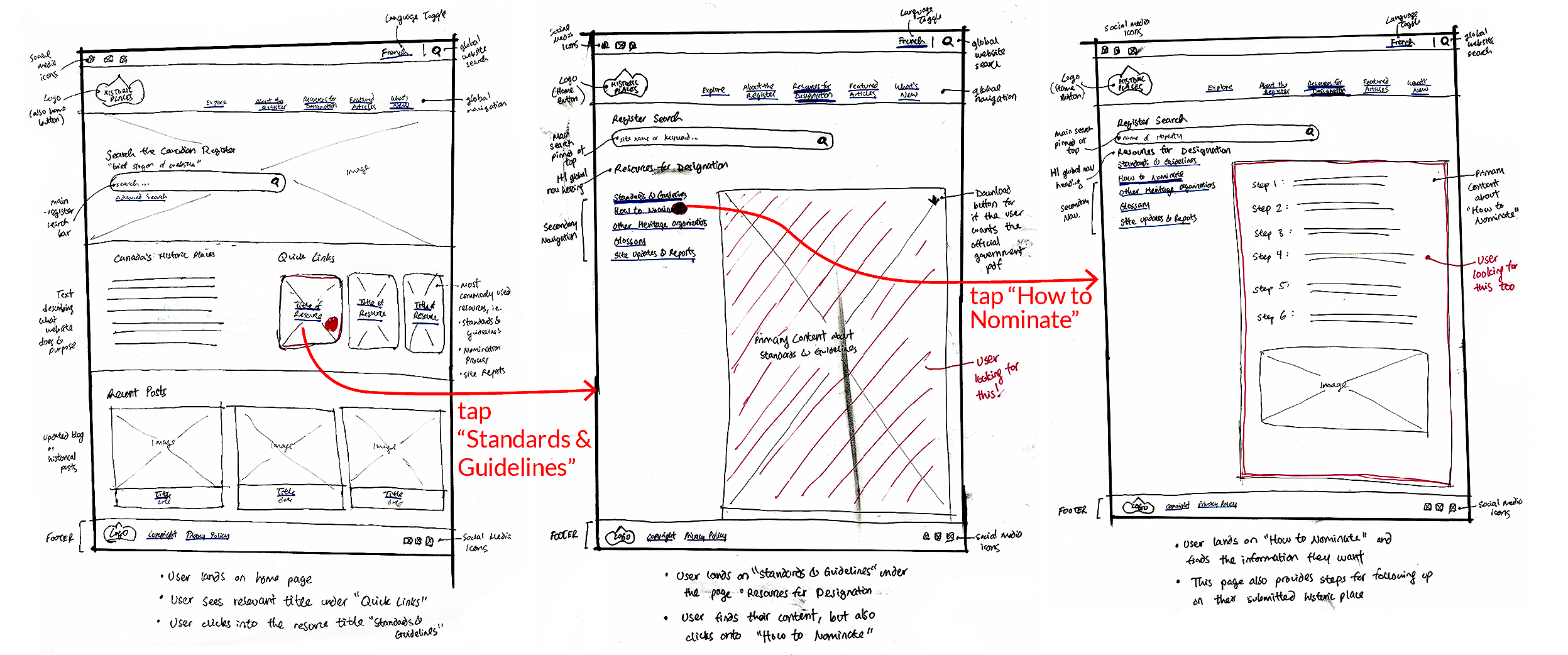
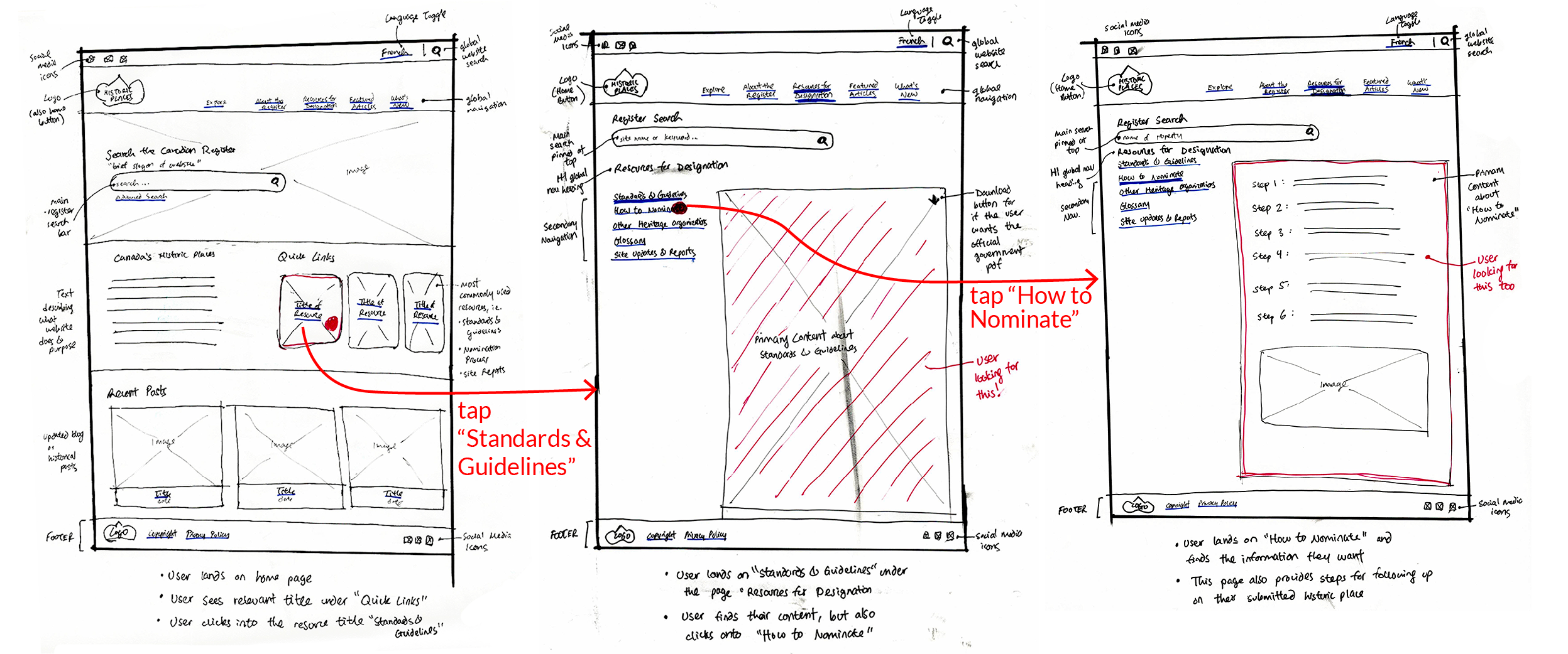
TASK:
Find the Nomination Process
Find the Nomination Process
TASK:
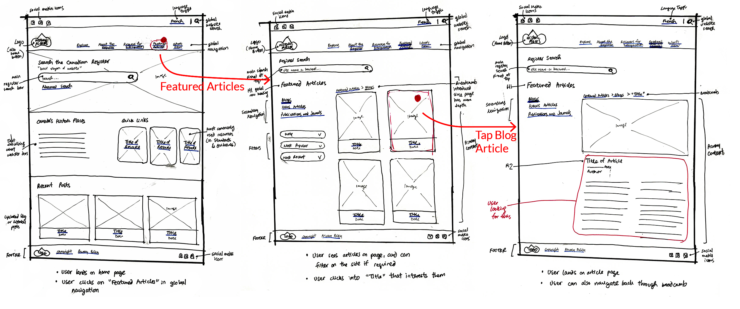
Find a Related Story
Find a Related Story
Our Solutions
1
Large Prominent Search Bar
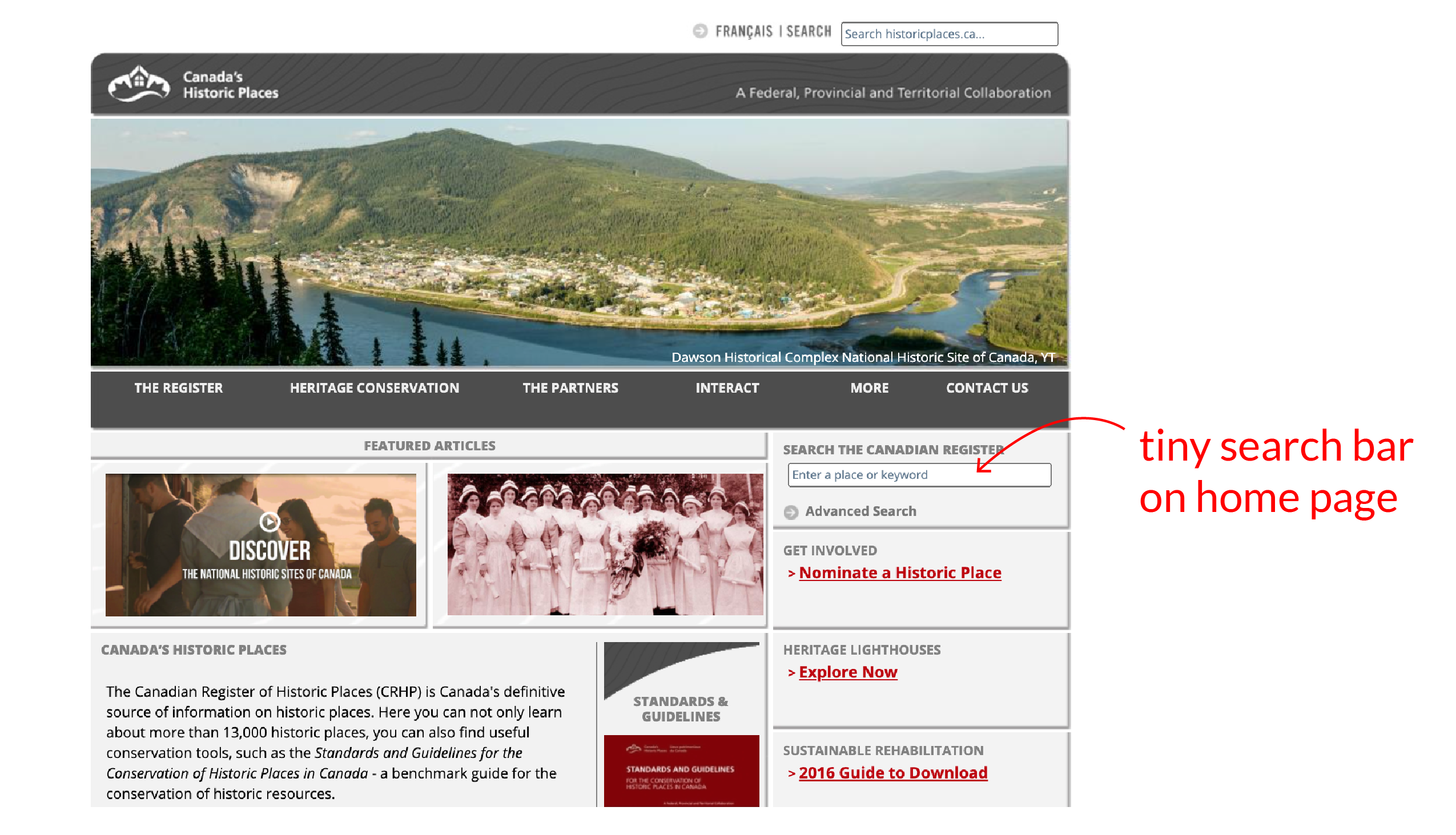
The home page has prominent search bar for heritage properties. This is also pinned on every page.
Before
2
Interactive Map
As Canada’s national register, users can easily see heritage properties with visual imagery and search by area.
Before
3
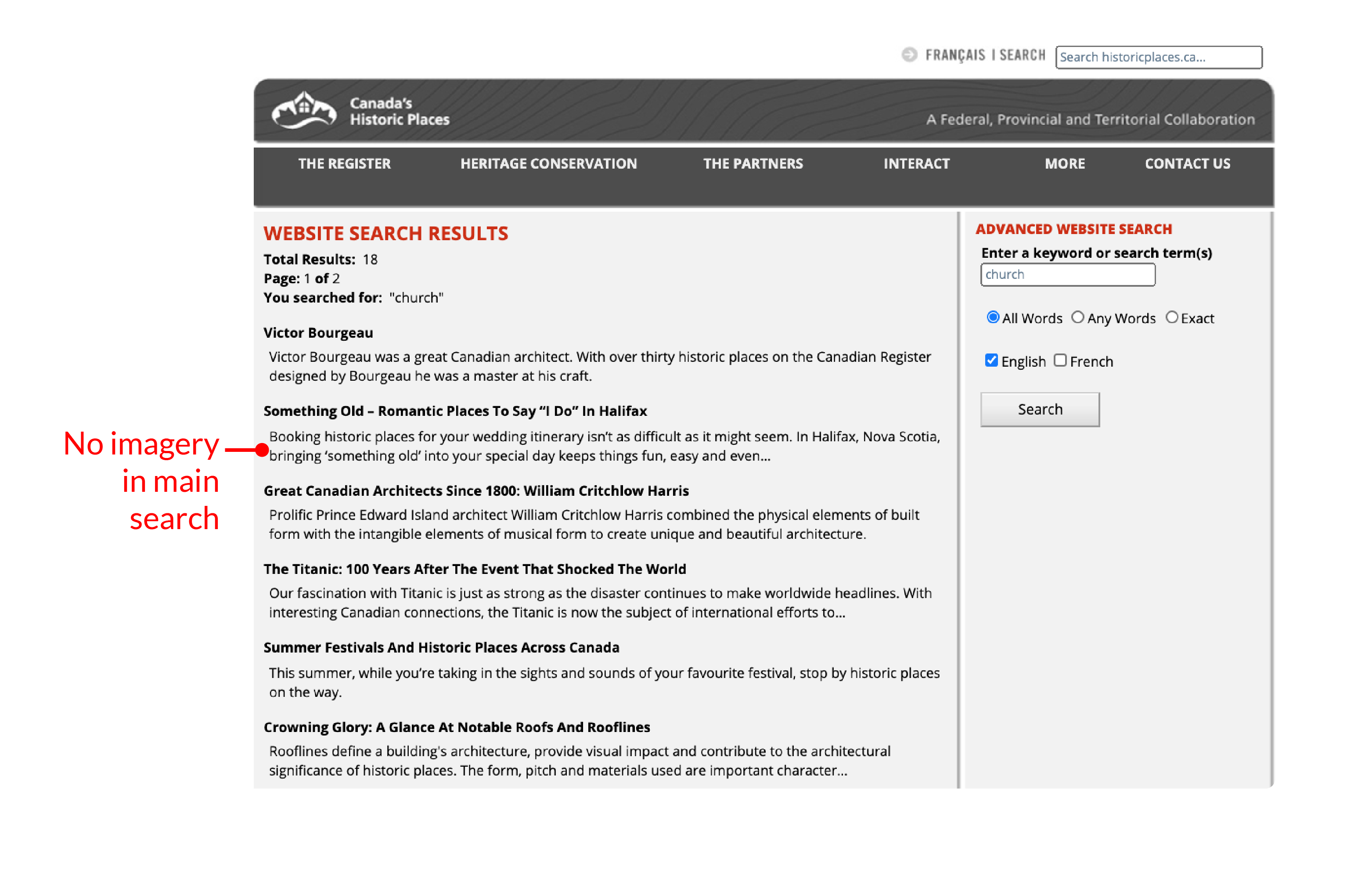
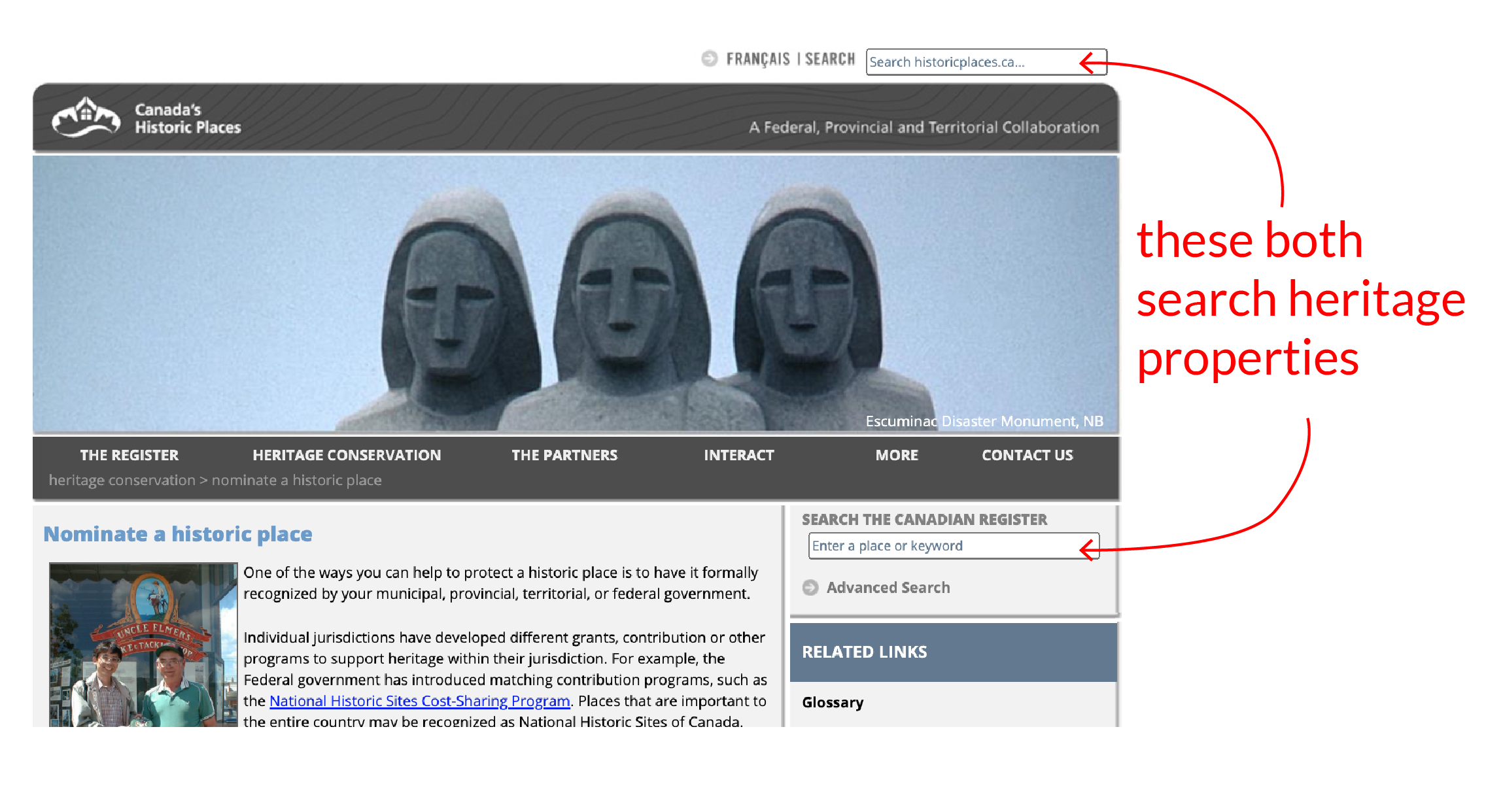
Global Website Search
Allow users to search other site elements and not just historic properties. For example, finding blog articles.
Before
4
IA Restructure
Based on the cardsort, here is the proposed IA model. It now includes articles and events, friendly to public users.
Proposed IA
5
Secondary Navigation
To help the user situate themselves clearly, a secondary navigation has been included on each global page. “Date and Links” was a popular request and added in the properties page.
6
Date Filter
Users can now search with a date filter, an important feature for heritage research.
This was a personal project to me since my background is in architectural design. I’m thankful my group agreed to use historicplaces.ca as the project!
One challenge was making sense of what was there. I find that redesign projects are sometimes harder to design for because it requires analysis for what is in-place, what works, and what needs to be fixed. With multiple users, I learned that it is also important to choose the dominant user group. In this case, it was the architectural professionals. They were the niche users, and it was important to specifically test on them, as opposed to the general public.
I particularly enjoyed learning the different research tools, namely Optimal workshop. In a past project, I analyzed cardsorting results manually, so this is much more effective and quick! The combination of cardsorting and interviews also gave me confidence that the redesigned organizational system would be understandable to users.